


The new Jmix version 1.5 has been released recently. In this blog post, we'll explore the new features and enhancements included in this release.
For full details and upgrade instructions, make sure to visit the What's New page in the documentation.
Studio UI/UX Changes
Let's begin with discussing the visible changes you'll notice in the updated Studio.
After several sessions of UX testing with developers who were unfamiliar with Jmix, we concluded that the current UI designer is overly complicated. With three tool windows and multiple XML/preview panels, it created a sense of confusion for those encountering it for the first time. On the other hand, we found out that people easily discover actions available on top of the current editor window and also tend to seek for available actions in context menus.
So we decided to get rid of the static components palette and move its contents into a popup window opened from different places: from the top actions panel, from the context menu of the component hierarchy, and from the Generate menu of the source code. The new popup supports search and drag-and-drop to the hierarchy or code:
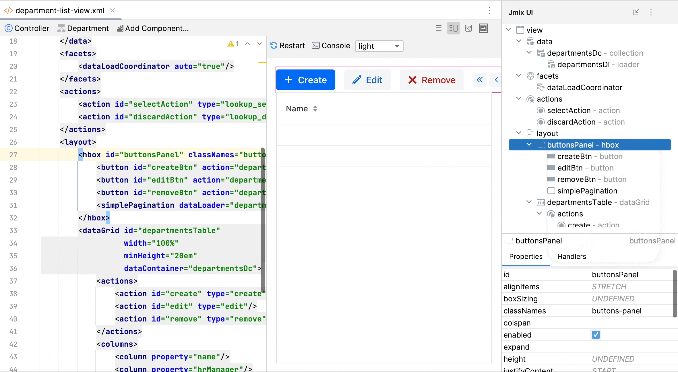
The component hierarchy and inspector were merged into a single tool window named Jmix UI, which is located on the right side by default. Consequently, the UI designer now has only one tool window, and the component palette is easily accessible from multiple points in the interface.
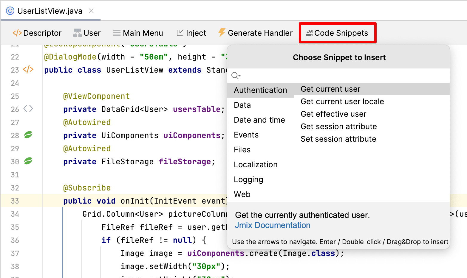
Another problematic feature of the Studio interface was the Code Snippets palette. Despite being especially useful for inexperienced users, it could hardly be noticed by newcomers. Now the code snippets are available in a popup window that can be opened from the top actions panel and the Generate menu when editing Spring beans and UI controllers:
Flow UI Improvements
We continue working on the Flow UI features to bring it closer to the state when it can be used as a primary UI technology in Jmix.
In this release, we updated the core to Vaadin 23.3 and integrated several components.
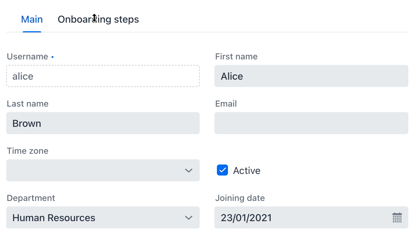
TabSheet
A tabsheet is essential when you need to fit a lot of UI components onto a single view. And this is a typical requirement in backoffice ERP-like applications where Jmix is most frequently used.
In the previous release, Jmix provided only the Tabs component which was not a container and required programmatic switching between separate layouts. Thanks to Vaadin 23.3, we now have the full-featured TabSheet with completely declarative layout:
<tabSheet width="100%">
    <tab id="mainTab" label="Main">
        <formLayout id="form" dataContainer="userDc">...</formLayout>
    </tab>
    <tab id="additionalTab" label="Onboarding steps">
        <vbox>
            <hbox>...</hbox>
            <dataGrid width="100%" dataContainer="stepsDc">...</dataGrid>
        </vbox>
    </tab>
</tabSheet>
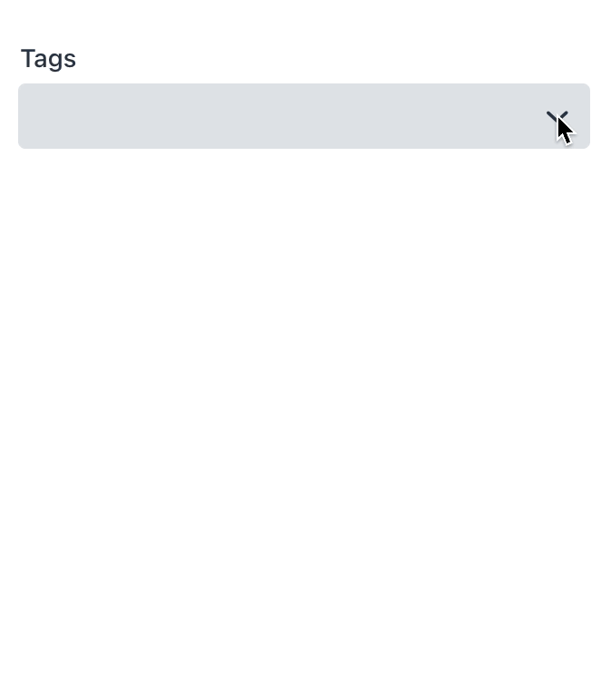
MultiSelectComboBox
The MultiSelectComboBox component also appeared in the latest Vaadin allows a user to select multiple values from a drop-down and show them nicely in the field. We've integrated it into Jmix and added the data binding so you can use it to display and modify entity collection attributes. In the following example, the MultiSelectComboBox component is used to manage the many-to-many collection of tags for a product:
<instance id="productDc"
          class="com.company.demo.entity.Product">
    <fetchPlan extends="_base">
        <property name="tags" fetchPlan="_base"/>
    </fetchPlan>
    <loader/>
</instance>
<collection class="com.company.demo.entity.Tag" id="allTagsDc">
    <fetchPlan extends="_base"/>
    <loader id="allTagsDl">
        <query>
            <![CDATA[select e from Tag e]]>
        </query>
    </loader>
</collection>
<!-- ... -->
<formLayout id="form" dataContainer="productDc">
    <textField id="nameField" property="name"/>
    <multiSelectComboBox property="tags" itemsContainer="allTagsDc"/>
</formLayout>
Upload Fields
The Vaadin's Upload component serves as the foundation for two Flow UI components: FileStorageUploadField and FileUploadField. The former is designed to upload a file to the file storage and returns a FileRef object which is saved in an entity attribute. The latter returns a byte array which is directly saved in an entity.
The declarative usage of both components is straightforward - you just set a data container with the entity instance and the property name where to save a FileRef or byte array:
<fileStorageUploadField id="uploadField"
        dataContainer="userDc" property="picture"/>
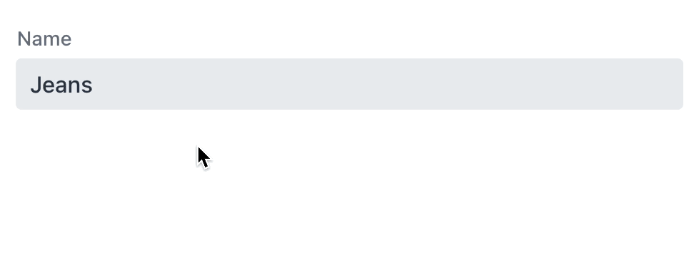
Image
The Image component also got the Jmix data binding. Now it can be easily used with an entity attribute of the FileRef or byte array type:
<image id="image"
        dataContainer="userDc" property="picture"
        height="280px" width="200px" classNames="user-picture"/>
To configure the image placement, use CSS styles. For example, to scale the image while maintaining its aspect ratio, create the following class and use it in the classNames attribute of the component:
.user-picture {
    object-fit: contain;
}
Tooltip
Tooltips can display additional information about a UI component in a popup next to it. They appear on hover and keyboard focus.
For components supporting tooltips, the Studio UI designer shows the Add button in the inspector panel:
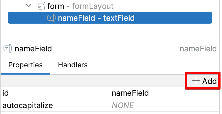
In the XML, the tooltip is defined in the nested element:
<textField id="nameField" property="name">
    <tooltip text="Product name" position="BOTTOM_START"/>
</textField>
Generic Filter
One of the most popular components in the classic UI is Filter which allows users to select data based on different criteria, including entity properties, references, JPQL queries, and conditional operators. It's like a versatile Swiss Army Knife for structured data search - developers need only to include it in the screens and users can customize it and apply when needed.
In Jmix 1.5, we've added the GenericFilter component to the Flow UI with the basic feature: users can create any number of property conditions for the whole graph of entities. And as everything in Flow UI, the filter is fully responsive:
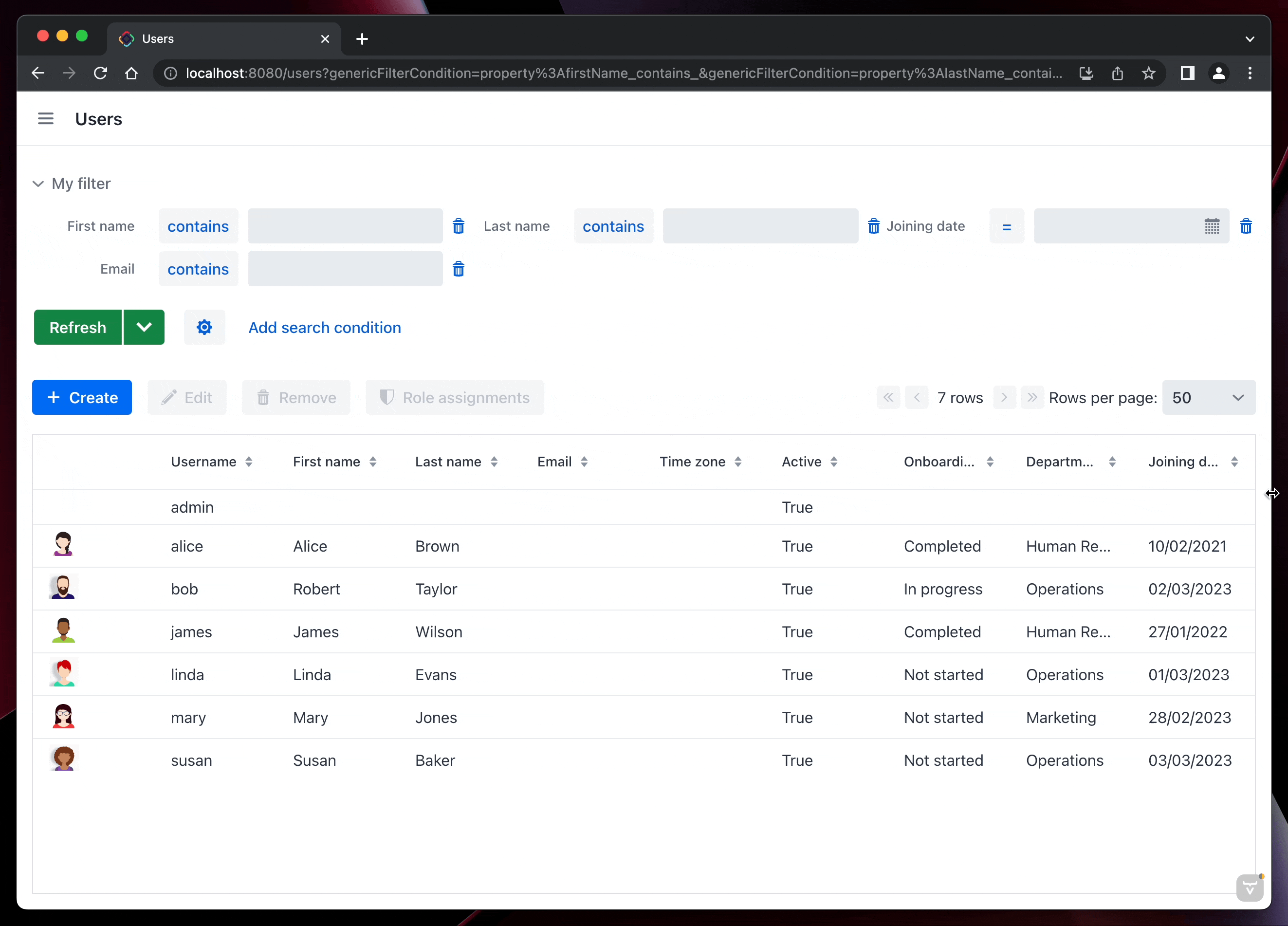
You can configure the breakpoints where the filter changes its layout in the responsiveSteps nested element:
<genericFilter id="filter" dataLoader="usersDl"
			   summaryText="My filter">
	<responsiveSteps>
		<responsiveStep minWidth="0" columns="1"/>
		<responsiveStep minWidth="800px" columns="2"/>
		<responsiveStep minWidth="1200px" columns="3"/>
	</responsiveSteps>
</genericFilter>
Obviously, the filter should keep its state when navigating between views or refreshing the web page. Otherwise users will lose the filtering conditions, for example after editing a record in a detail view. The queryParameters facet provides automatic mapping of filter conditions to the current URL, which ensures the correct filter state when navigating and provides deep links including the filter conditions. The minimal configuration of the facet should just reference the filter component by its id:
<facets>
    <queryParameters>
        <genericFilter component="filter"/>
    </queryParameters>
</facets>
The development of the GenericFilter component is ongoing, and we intend to include all of the classic filter features in the Flow UI with the June 2023 release.
Add-ons with Flow UI
In release 1.5, we have implemented Flow UI modules for the following popular open-source add-ons:
- Multitenancy
- Quartz
- Application Settings
- Grid Export Actions
They are now available in the Studio add-ons marketplace when working on a project with Flow UI.
Flow UI Menu
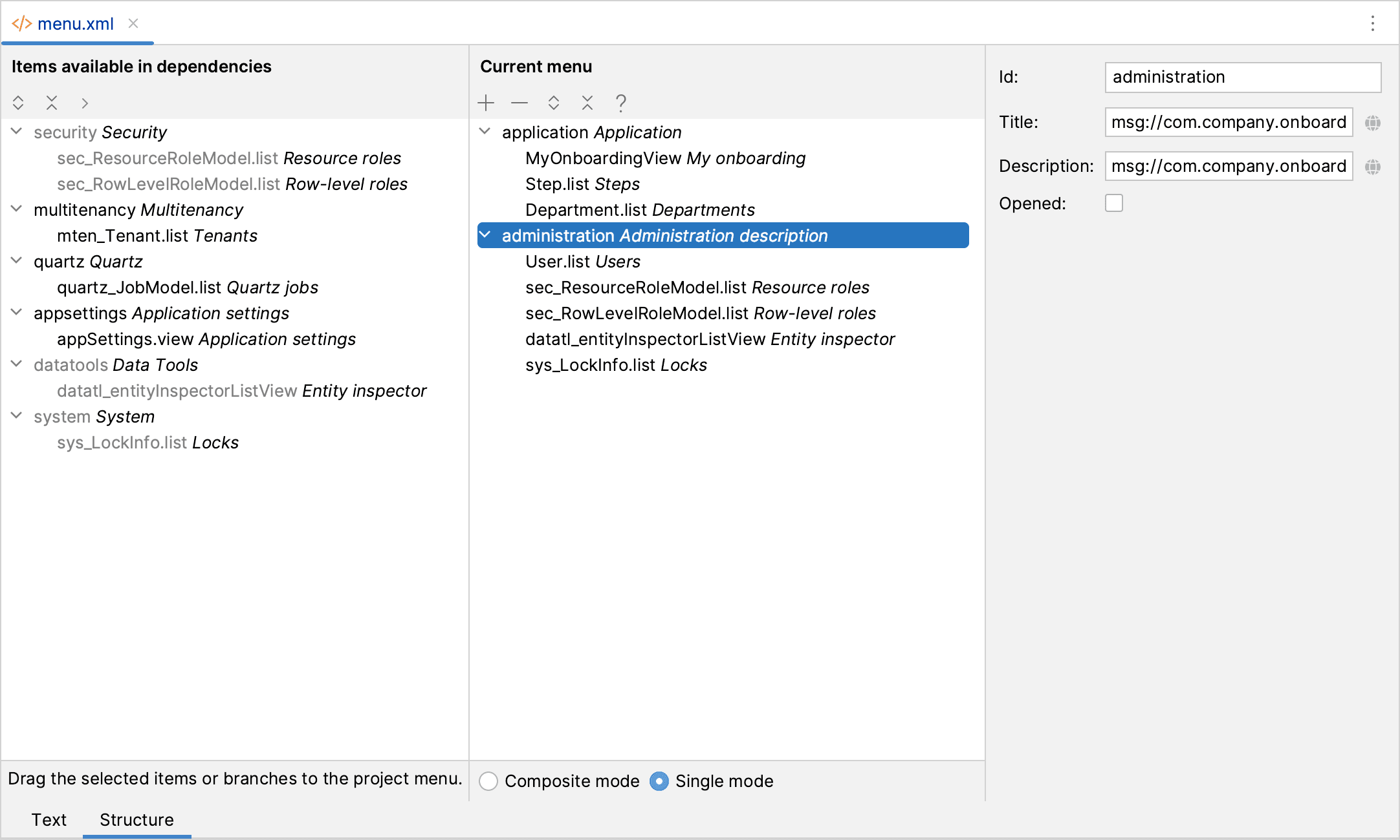
You might notice that the main menu in Flow UI is structured differently from the classic UI: each add-on has its own root node with a predefined order, and there is no common "Administration" menu. This default structure is good enough for experiments and prototypes, but for a real-world application you will need a completely customized menu. So you need to switch from the "composite" to the "single" menu mode and define your own structure.
Previously many developers refrained from using the "single" mode as much as possible because it led to a problem with including new add-ons in the project: their menu items didn't appear in the application menu and it was unclear how to add them.
Now this problem with the "single" mode is solved in the Flow UI menu designer. As soon as you switch to the "single" mode, the designer shows an additional panel on the left. It contains all menu items provided by the add-ons and available for use in the application. So when you include a new add-on, you can just open the designer and drag-and-drop the add-on menu to your custom application menu in a desired location.
Excel Export
One of the very frequently used Jmix features is the ability to export data displayed in a UI table to Excel in one click. This feature was designed to export precisely the set of rows visible to the user at the moment, that is the current page selected with by a filter. But often users wanted to export all selected data instead of just the current page.
In release 1.5, we improved the excelExport action provided by the Grid Export Actions add-on to export all data if the user selects the "All rows" option in the export dialog. Loading of data is performed in batches for optimal performance and server memory usage.
The new behavior is available both for classic and Flow UI.
Pessimistic Locking UI
The framework now provides a default UI for managing pessimistic locks. You can find it in the Administration menu of Classic UI and the System menu of Flow UI.
A system administrator can view the list of current locks and manually remove a lock if needed.
Root Liquibase Changelog
Jmix has always done a great job helping developers to create and run Liquibase changelogs for database versioning. Studio generates changelogs for the difference between the data model and the database schema and runs them when starting the application. When a new version of the application starts in a test or production environment, it runs Liquibase to apply the schema changes on the connected databases.
But sometimes this simple workflow is not enough and developers need to run Liquibase outside of Studio or the application, for example, on a CI server using Liquibase CLI or Gradle plugin.
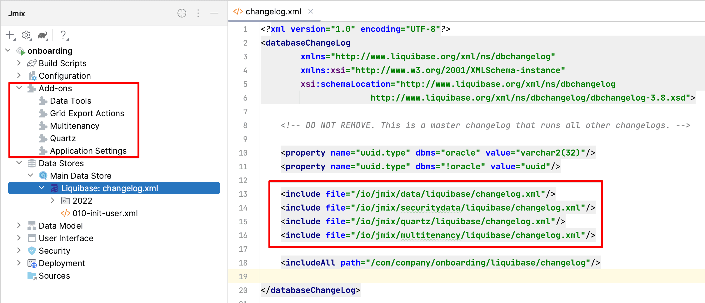
Previously it was impossible because the root changelog file of the project didn't define changelogs provided by the add-ons. Jmix took the information about used add-ons from the project configuration and created the correct changelog dynamically in memory before running Liquibase.
Since Jmix 1.5, the root changelog file of the project is always complete and can be executed by Liquibase CLI or Gradle plugin. Studio automatically updates the includes whenever add-ons are added or removed. Also, when you start the application, Studio checks that includes in the root changelog correspond to the add-ons used in the project. If it finds a mismatch, Studio shows a notification dialog and suggests to add or remove includes.
The root changelog can be opened from the Jmix tool window by double-clicking on the Liquibase node of a data store:
What's next?
In the next feature release scheduled for June 2023, we are going to update the underlying stack of technologies to the latest major versions of Spring Framework, Spring Boot, EclipseLink and Vaadin. It will also require Java 17 as a baseline for developing and running applications.
Another important milestone will be implementation of Flow UI modules for the most frequently used Jmix add-ons: Reports and BPM.
Our detailed roadmap for the future releases is published as a GitHub project. Patches for the current version 1.5 will be released approximately once a month to ensure regular updates.
We welcome your feedback on our forum, and thanks to all who contributed with their ideas, suggestions and bugreports!


