


The new Jmix version 2.1 has been released recently. In this blog post, we'll explore the new features and enhancements that have been included in this release.
For full details and upgrade instructions, make sure to visit the What's New page in the documentation.
New Add-ons
We've implemented a bunch of add-ons which were previously available in Jmix v.1 with Classic UI. Now you can easily include the same ready-to-use functionality in your project with the modern Flow UI based on Vaadin 24.
Maps
The Maps add-on has undergone a complete overhaul. It now features a new API and excellent support in Studio.
Here is an example that demonstrates how to display OpenStreetMap with a marker at a specific location:
<maps:geoMap id="map" width="100%" height="100%">
    <maps:layers>
        <maps:tile>
            <maps:osmSource/>
        </maps:tile>
        <maps:vector id="pointsLayer">
            <maps:vectorSource/>
        </maps:vector>
    </maps:layers>
</maps:geoMap>
@ViewComponent
private GeoMap map;

@Subscribe
public void onInit(InitEvent event) {
    VectorLayer vectorLayer = map.getLayer("pointsLayer");
    VectorSource vectorSource = vectorLayer.getSource();
    vectorSource.addFeature(new MarkerFeature(
            GeometryUtils.createPoint(12.496176, 41.902695)));
}
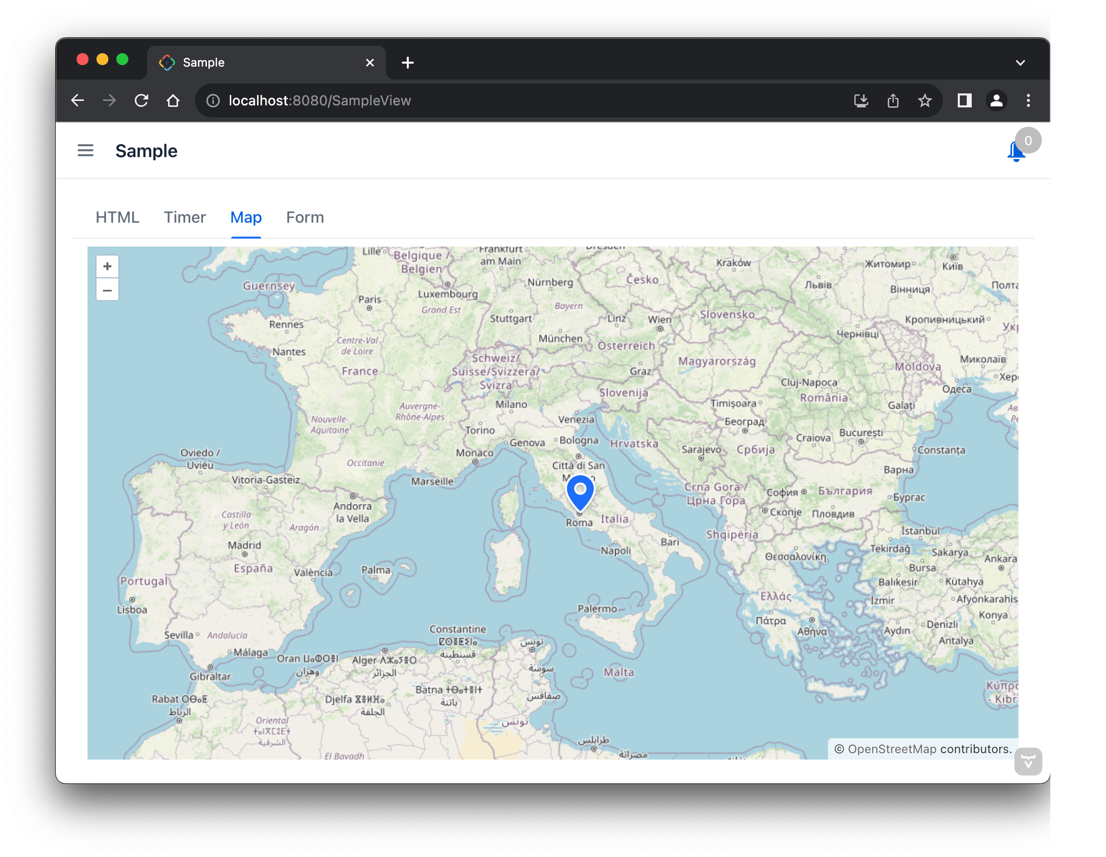
This example is of the "hello world" category and obviously doesn't cover all add-on features. In fact, the map can contain the tile, image and vector layers, each with different data providers. It can display markers, points, polylines and polygons. The work on this add-on is not yet complete, it will be significantly improved in the next release.
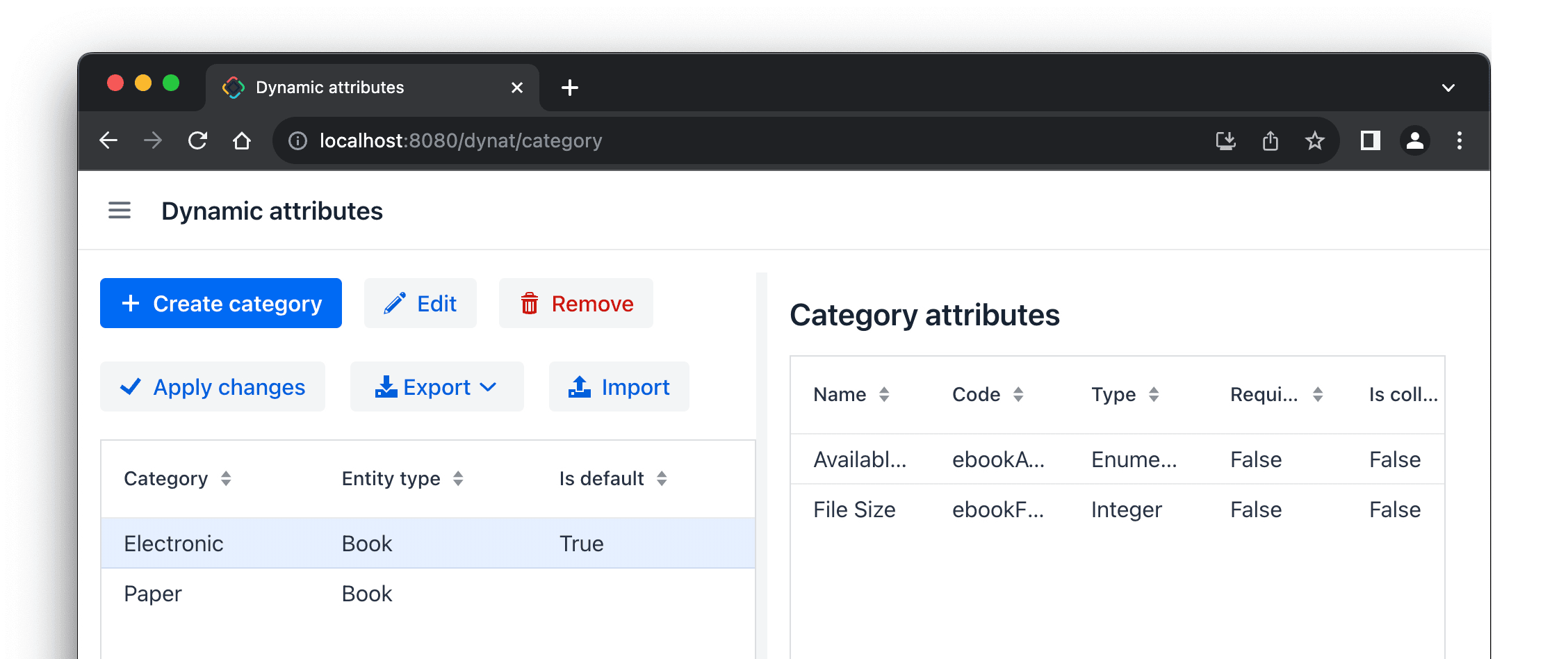
Dynamic Attributes
The Dynamic Attributes add-on allows you to define new entity attributes without changing the database schema and restarting the application. Additional attributes defined for an entity can be optionally split into multiple categories.
For example, a Book entity can be classified into two categories: Electronic and Paper. The electronic books have Available Formats and File Size attributes, whereas paper books have Cover Type, Weight and Dimensions attributes. You define dynamic attributes in the application UI:
After configuring the attributes, users can view and enter them in the existing views:
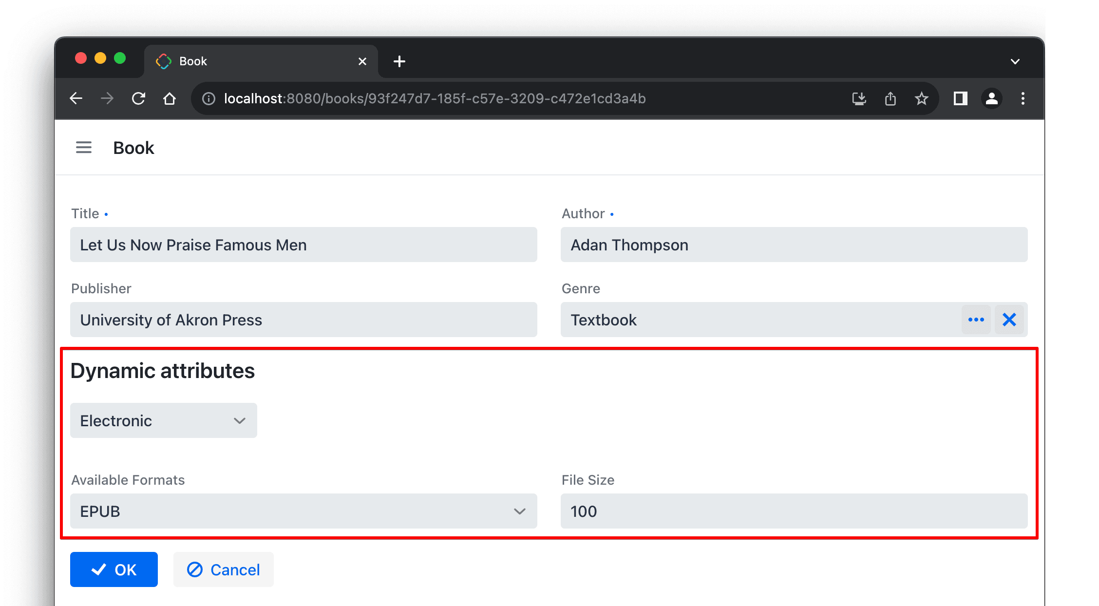
Dynamic attributes are automatically shown either in the special dynamicAttributesPanel component (as shown above), or in any existing formLayout and dataGrid.
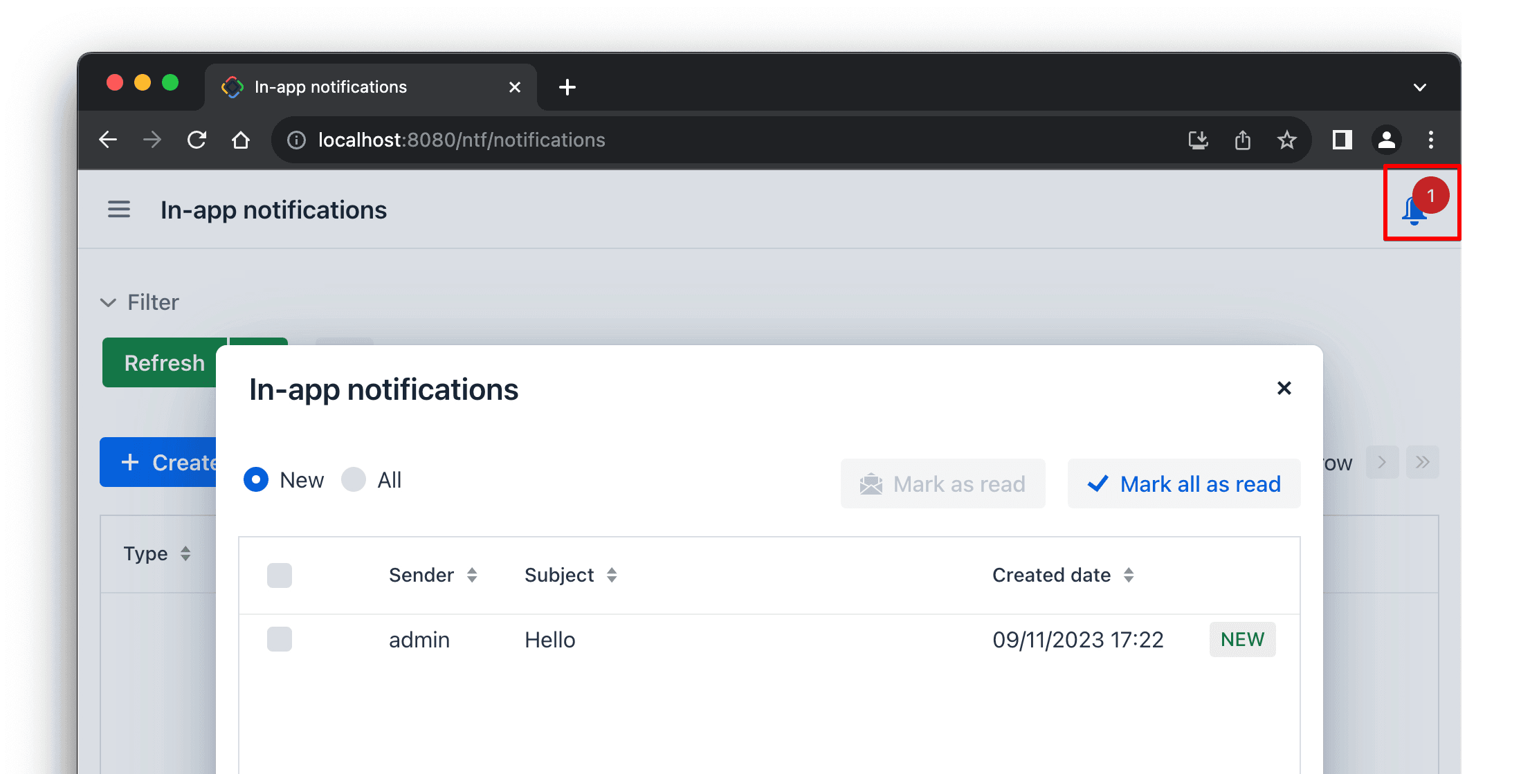
Notifications
The Notifications add-on is designed for sending in-app or email notifications to the users. A notification can be sent though the API or using the view provided by the add-on:
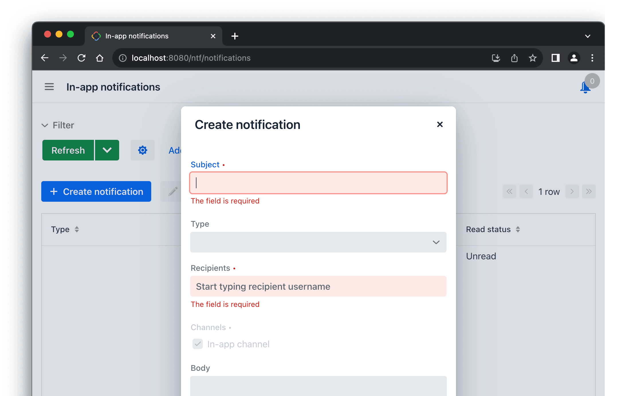
The application UI should include the notificationsIndicator component, for example in the main-view.xml:
<appLayout>
    <navigationBar>
        <header ...>
	        ...
            <ntf:notificationsIndicator classNames="ms-auto me-m"/>
        </header>
    </navigationBar>
The recipients will then be able to see the number of unread notifications in the indicator and open them in the convenient UI:
Search
The Search add-on provides the integration with Elasticsearch to enable full-text search functionality across data and uploaded files in your application. In order to use the add-on, you only need to follow a few simple steps.
Define the connection to Elasticsearch:
jmix.search.elasticsearch.url = http://localhost:9200
Create an annotated Java interface describing what has to be indexed:
@JmixEntitySearchIndex(entity = Book.class)
public interface BookIndexDef {

    @AutoMappedField(includeProperties =
            {"title", "author", "publisher", "genre.name"})
    void bookMapping();
}
Add the searchField component to the application UI:
<drawerLayout>
    <section ...>
		<search:searchField/>
That's it. The Book entity data will be automatically indexed (and reindexed on each change) and users will be able to perform full-text queries in the created index:
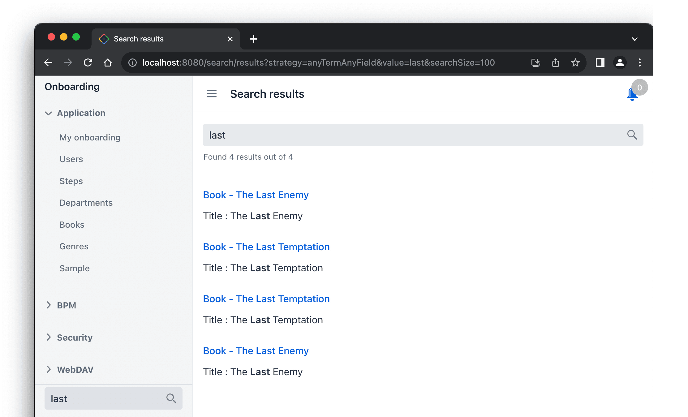
The search results are automatically filtered according to the data access permissions of the current user, eliminating any concerns of information leaks.
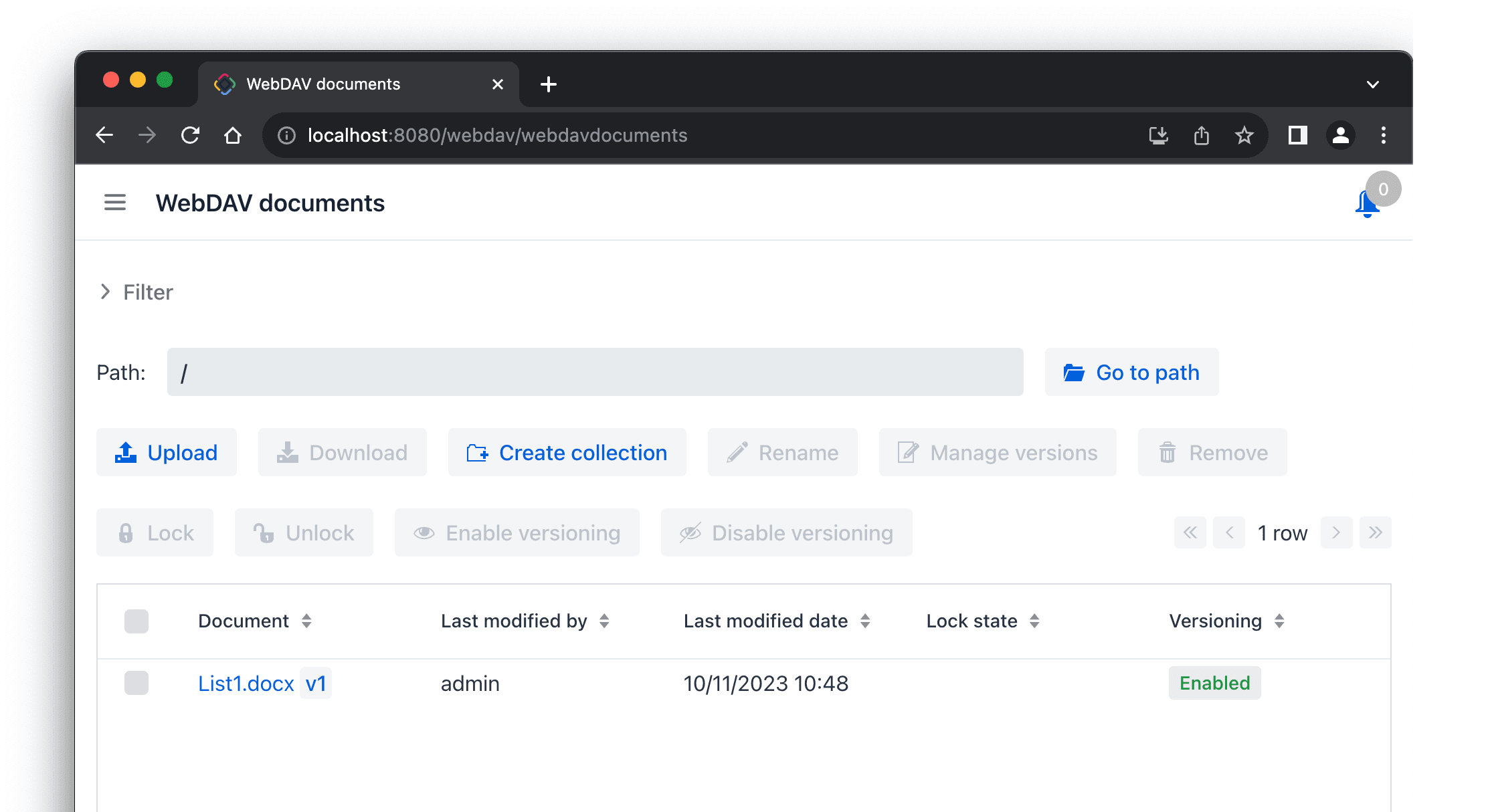
WebDAV
The WebDAV add-on provides access to files located in the file storage through the WebDAV protocol. This allows users to seamlessly open and edit files using their desktop applications (Word, Excel, LibreOffice, etc.) without the need to download and upload files to the web application. On the UI layer, the add-on provides a specific upload field and the administrative view for managing files and their versions:
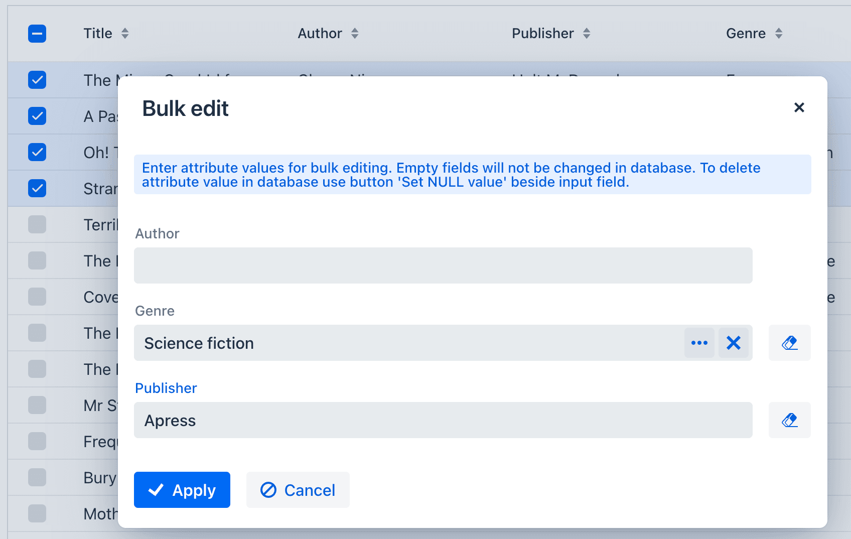
Bulk Editor
The Bulk Editor add-on is designed to allow users to change attribute values for multiple entity instances at once. It provides an action which you can add to any dataGrid:
<dataGrid id="booksDataGrid" ...>
    <actions>
	    ...
        <action id="bulkEdit" type="bulked_edit"/>
    </actions>
This action opens a dialog where the user can enter values for entity attributes. These attributes will be updated for all selected entity instances:
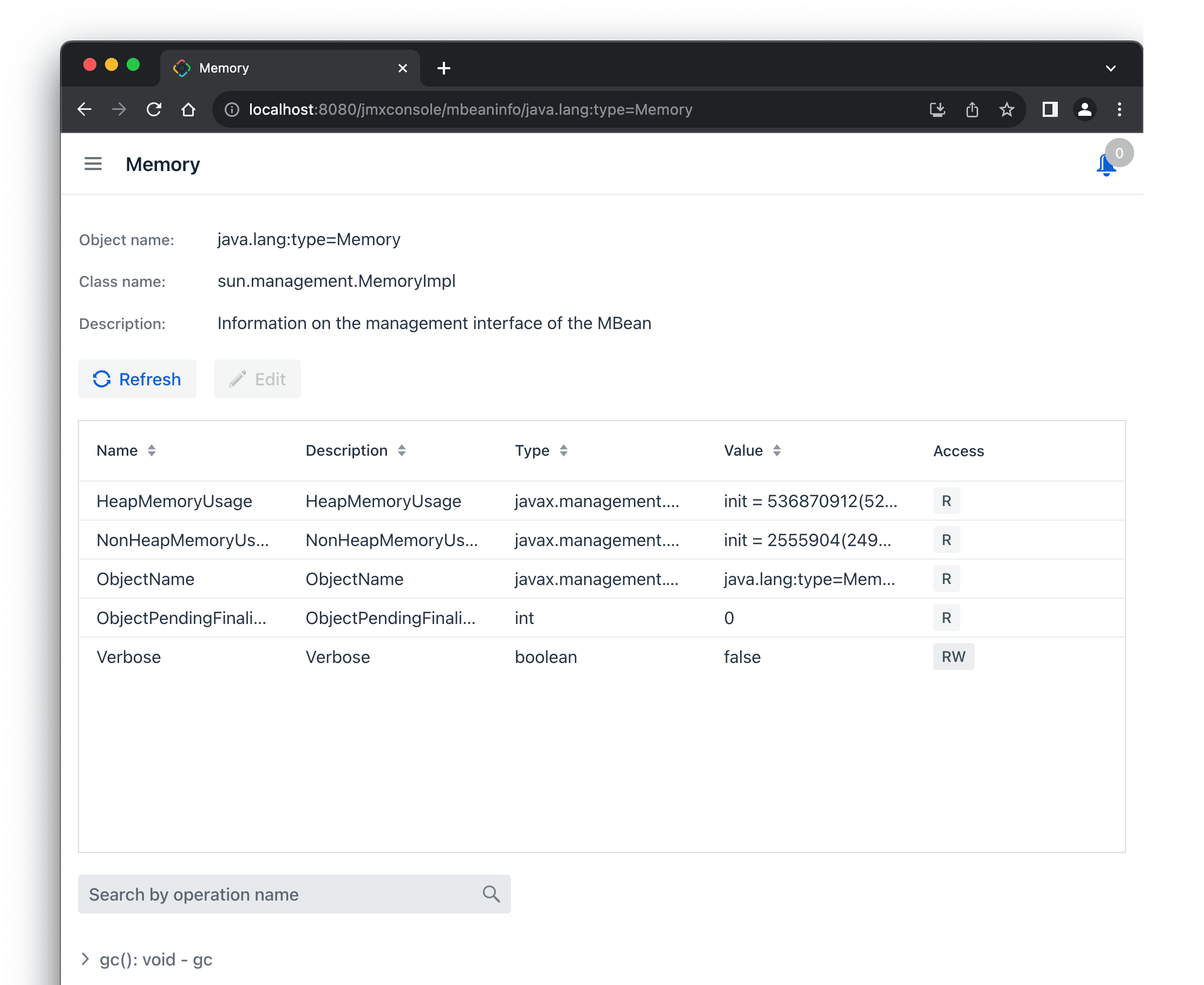
JMX Console
The JMX Console add-on provides a web interface to Java Management Extensions (JMX) API. It allows system administrators to inspect JMX beans, edit attributes and invoke operations right in the application UI:
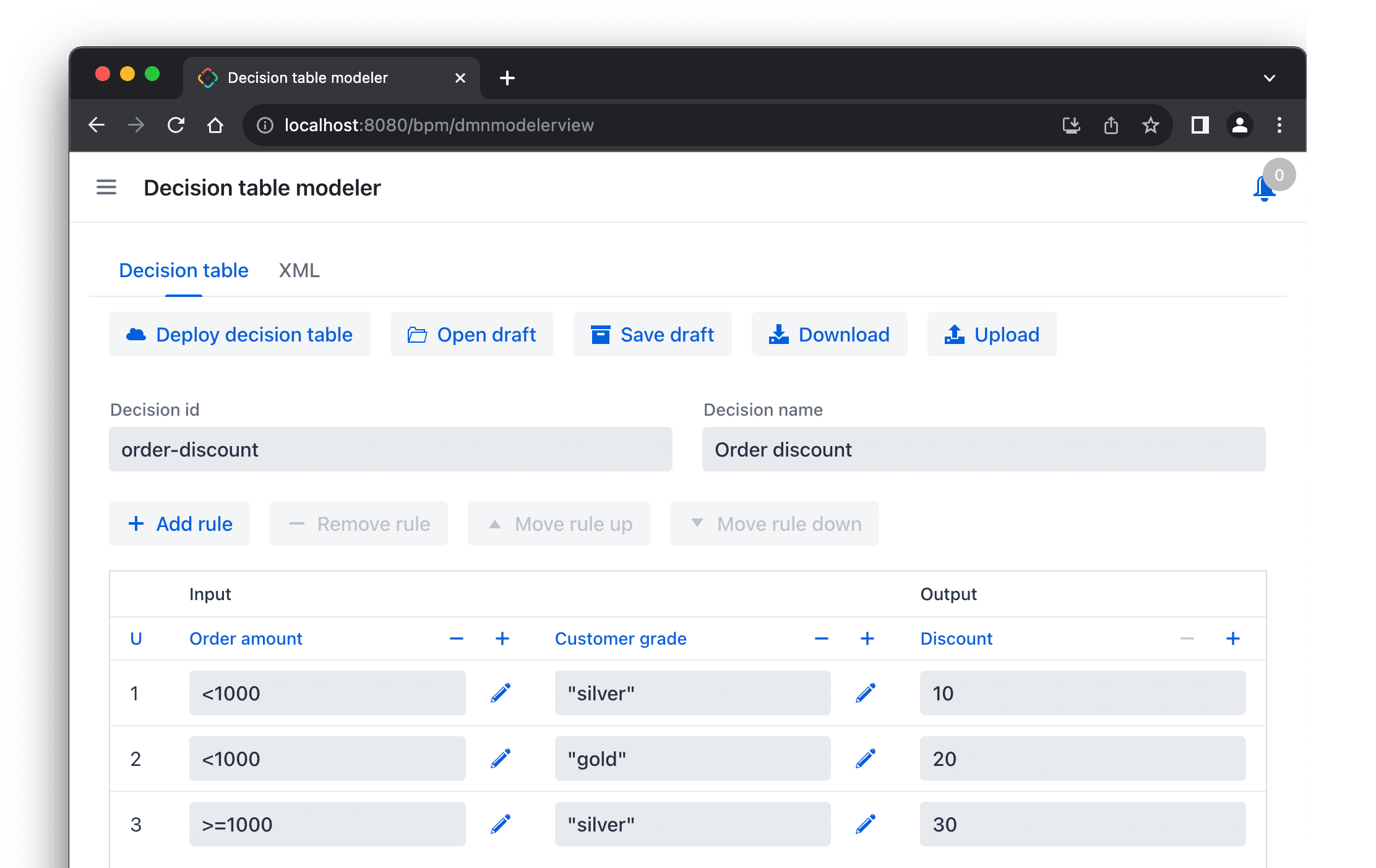
BPM Improvements
The DMN table modeler is now available in the application UI:
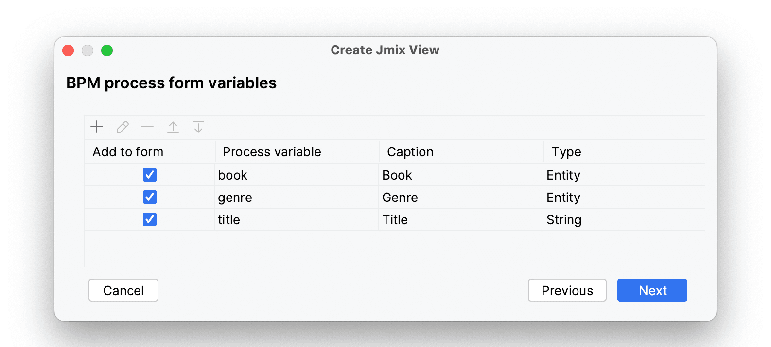
The process form wizard can now generate fully functional views for editing process variables and choosing outcomes.
The wizard shows variables defined in the process:
and allows you to define outcomes:
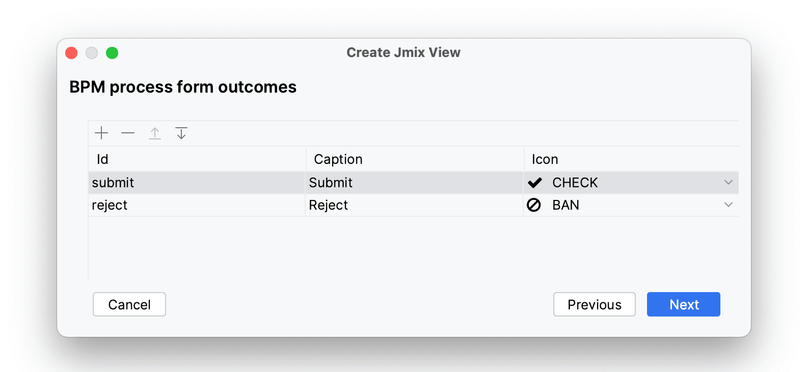
Based on your choice, the wizard generates the view code for injecting process variables into UI components and completing the task with the selected outcomes:
@ProcessForm(outcomes = {
        @Outcome(id = "submit"),
        @Outcome(id = "reject")
})
// ...
public class BpmProcessForm extends StandardView {

    @Autowired
    private ProcessFormContext processFormContext;

    @ProcessVariable
    @ViewComponent
    private EntityPicker<Book> book;

	// ...
    @Subscribe("submitBtn")
    protected void onSubmitBtnClick(ClickEvent<JmixButton> event) {
        processFormContext.taskCompletion()
                .withOutcome("submit")
                .saveInjectedProcessVariables()
                .complete();
        closeWithDefaultAction();
    }
Data Grid Improvements
This release includes significant enhancements to the dataGrid component which is widely used for presenting data in a tabular format.
Now users can sort dataGrid by multiple columns. The sort order is indicated by numbers displayed next to the sorting arrows:
Sorting is defined by the multiSort, multiSortOnShiftClickOnly and multiSortPriority attributes of the dataGrid component.
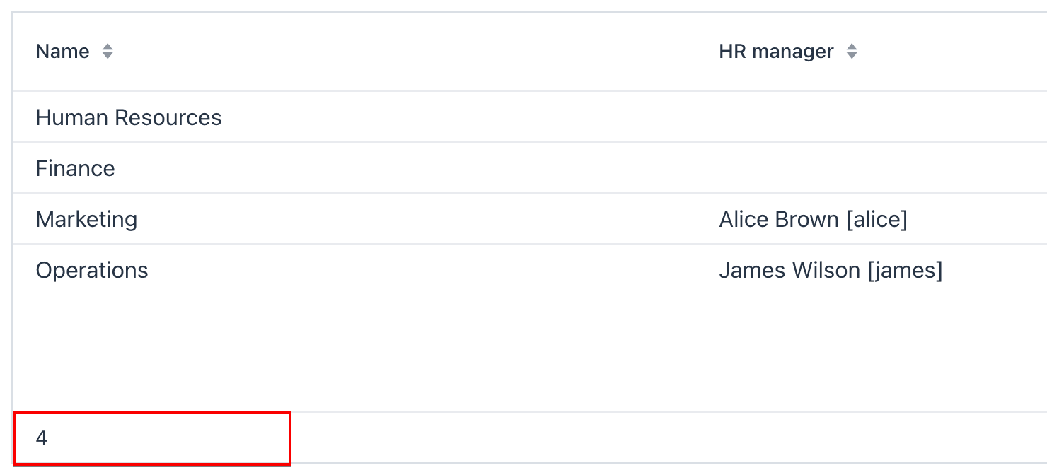
Another new feature is aggregation of values in rows. To configure aggregation for a column, set the aggregatable attribute of the dataGrid component to true, add the aggregation element to the column and select the aggregation type. Aggregated values will be shown in a separate row:
The next improvement is the ability to assign renderers to dataGrid columns declaratively. Those who are familiar with Jmix Classic UI will find that columns with declarative renderers closely resemble "generated columns" in Classic UI. You define a column in XML and create a handler method that returns a renderer:
@Supply(to = "stepsDataGrid.completed", subject = "renderer")
private Renderer<UserStep> stepsDataGridCompletedRenderer() {
    return new ComponentRenderer<>(userStep -> {
	    // ...
        return checkbox;
    });
}
There are several pre-built renderers available that can be assigned to a column in XML in order to format dates and numbers. Additionally, a column can now be defined in XML without being bound to an entity attribute, solely for the purpose of declaring a renderer for it.
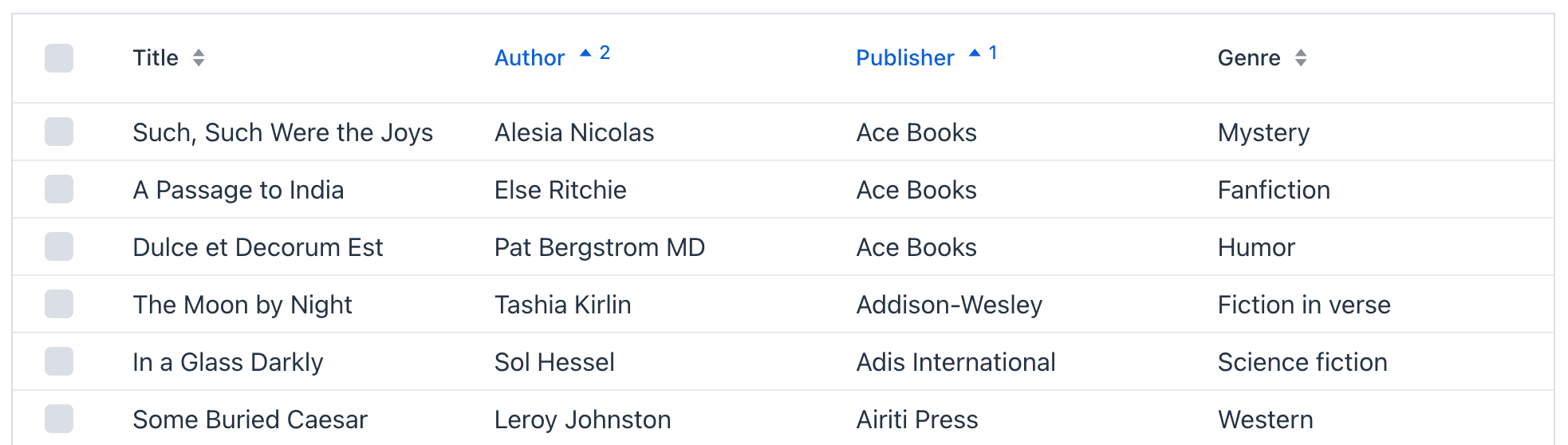
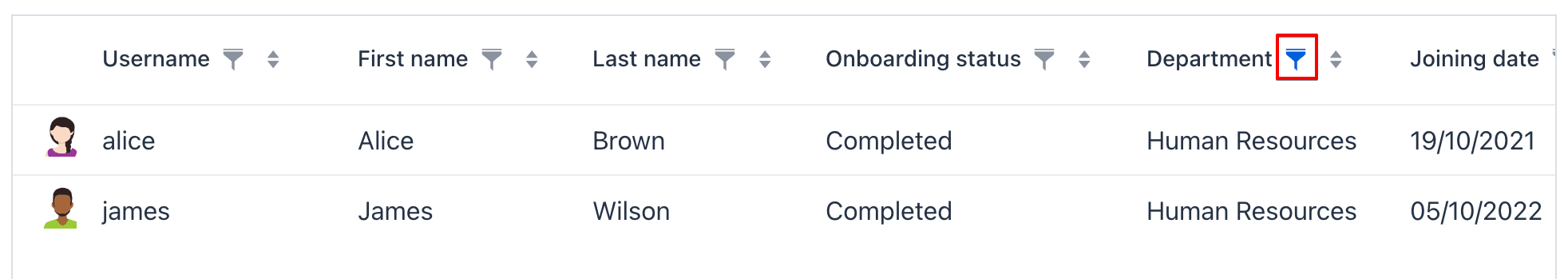
And perhaps the most exciting new feature of the data grid is a filter in column headers. You can define which columns should have a filter using the filterable attribute of the column XML element. Filterable columns have the "funnel" icon in their headers. If the user clicks this icon, a dialog with the property filter condition appears:
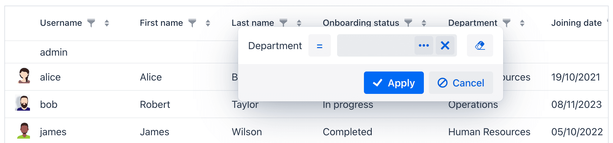
If a condition is set, the icon in that column is highlighted:
The concept of a filter in the column headers is familiar to users from many popular products including Excel, so this feature is easy to discover and use. We believe that this approach to filtering data is an excellent addition to the other two components aimed for the same task: genericFilter and propertyFilter. The genericFilter component is fully customizable at runtime and provides advanced conditions, but may not be the easiest to use. On the other hand, propertyFilter is straightforward for users but needs to be configured by the developer beforehand. The data grid column filter is similar to propertyFilter in capabilities, but it doesn't occupy any screen space and therefore can be the default choice for most views displaying tables of data.
It's important to note that all three filtering features can be used together on the same view and data loader without any conflicts. The conditions of all filters will simply be combined using the logical AND operator.
New UI Components and Facets
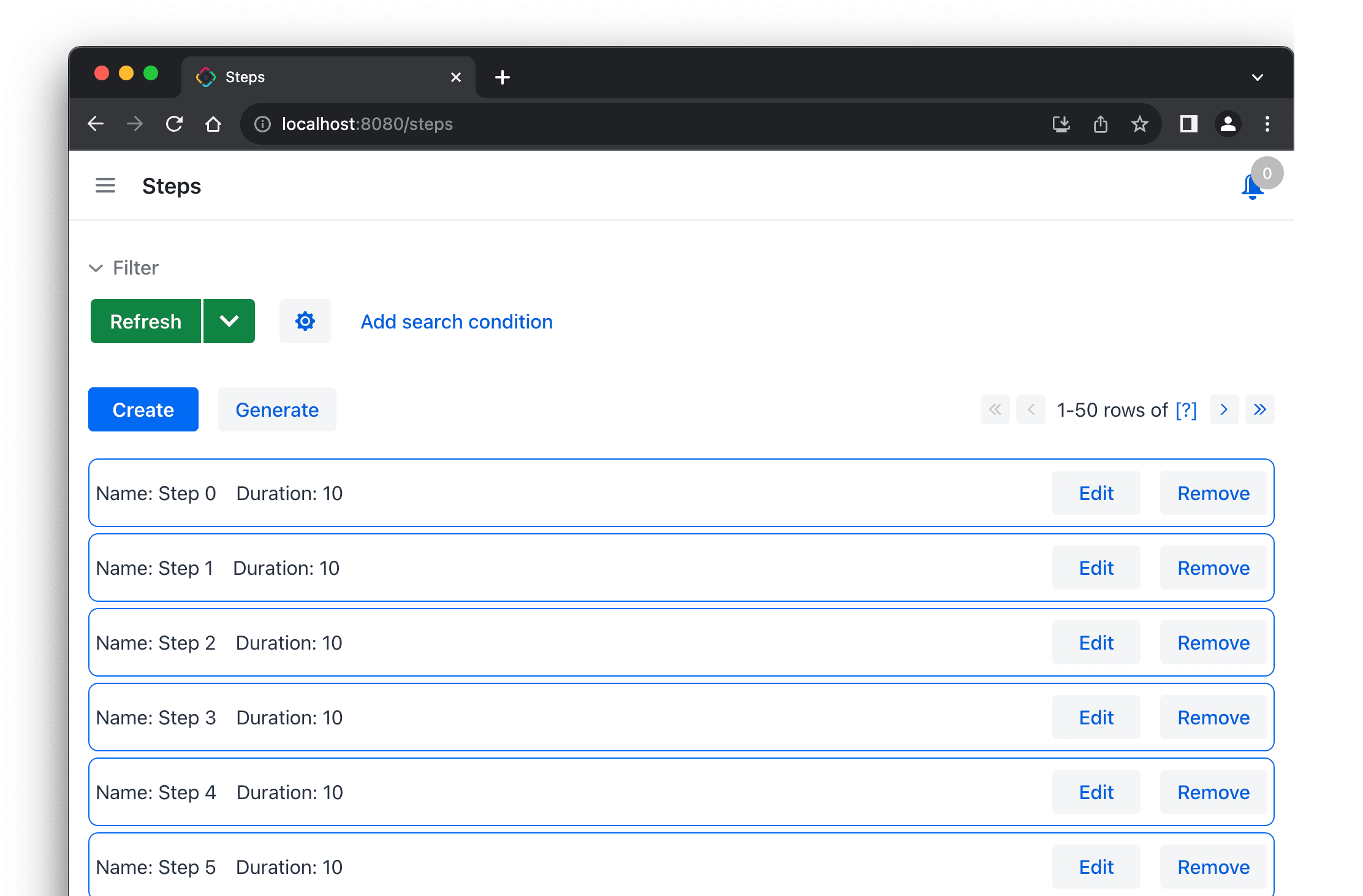
VirtualList
The new virtualList component is designed for displaying lists of items with arbitrary content. It only renders the portion of items that is currently visible, ensuring good performance regardless of the complexity of the content.
virtualList can be used in views instead of dataGrid. You define the component in XML and connect it to a collection data container:
<virtualList id="stepsVirtualList" itemsContainer="stepsDc"/>
The filtering and paging components like genericFilter and simplePagination connected to the data loader will affect the content of virtualList the same as of dataGrid.
Then you need to create a handler method that renders the list item content:
@Supply(to = "stepsVirtualList", subject = "renderer")
private Renderer<Step> stepsVirtualListRenderer() {
    return new ComponentRenderer<>(step -> {
	    // ...
        return hbox;
    });
}
After spending some effort to coding the layout of the virtualList items, you can get a view similar to this one:
Html
The html component allows you to insert arbitrary HTML content into views. The content can be defined inline in the nested content element, in a file located in the project resources, or in the message bundle to be easily internationalized.
Settings
The settings facet saves and restores settings of visual components for the current user. The facet automatically saves parameters of dataGrid columns, opened state of details and genericFilter, a selected page size of simplePagination. You can just drop the facet to a view and set its auto="true" attribute, and the facet will manage settings of all supported components of the view that have identifiers.
The settings facet also provides handlers that allow you to save and restore any properties of the view and its components.
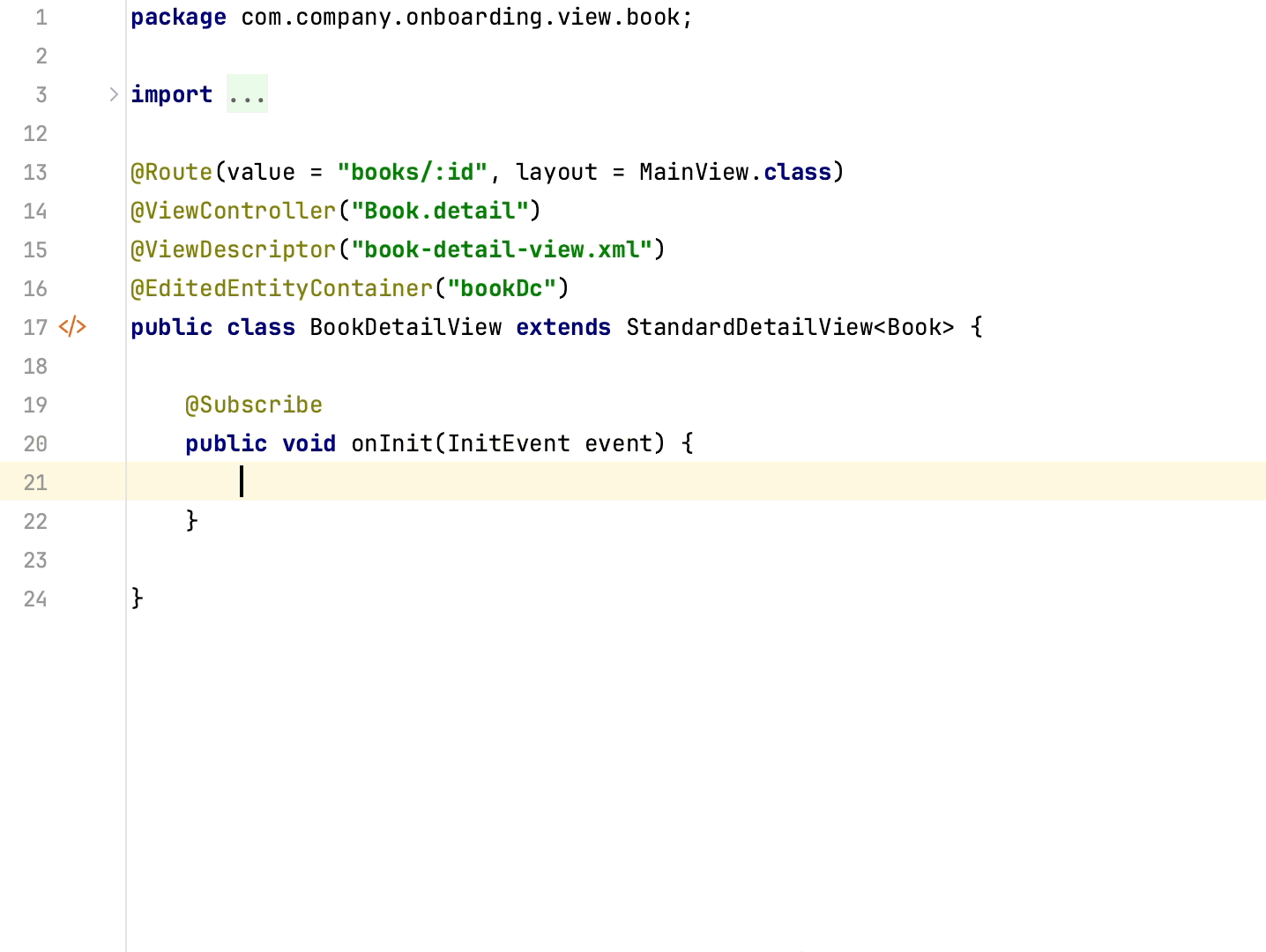
Timer
The timer facet is designed to run some view code at specified time intervals. It works in a thread that handles user interface events and can update view components. To use the facet, define its parameters in XML and create a handler for TimerActionEvent:
<timer id="timer" delay="2000" repeating="true" autostart="true"/>
@Subscribe("timer")
public void onTimerTimerAction(final Timer.TimerActionEvent event) {
	// ...
}
Fetching Items in Dropdowns
This release introduces a new and efficient method for loading data into dropdown components, such as comboBox, entityComboBox and multiSelectComboBox. Now you don't have to define a collection data container for the dropdown items and load it with the full list of options in advance. Instead, you can define the itemsQuery nested element in the dropdown component itself and write a query like this:
<entityComboBox id="departmentField" property="department" pageSize="30">
    <itemsQuery class="com.company.onboarding.entity.Department"
                fetchPlan="_instance_name"
                searchStringFormat="(?i)%${inputString}%">
        <query>
            <![CDATA[select e from Department e
            where e.name like :searchString order by e.name]]>
        </query>
    </itemsQuery>
</entityComboBox>
The query will be executed when the user opens the dropdown and results will be limited to pageSize rows (50 by default). When the user scrolls through the list, data will be loaded by pages. If the user enters some text into the field, it is used for filtering the results.
Instead of writing the JPQL query in XML, you can define the itemsFetchCallback handler and load data programmatically from any source.
The itemsQuery feature offers significantly better performance for large datasets compared to the old approach of using separate collection data containers. With itemsQuery, items are loaded in small batches, reducing memory usage, and filtering is performed at the data store level. As a result, you can use datasets of virtually any size as sources of items in dropdown lists.
Obviously, for small datasets, using a separate pre-loaded collection container is still a better choice as it will provide faster response to the user.
View Designer Improvements
Now, let's discuss the new features and enhancements in Studio.
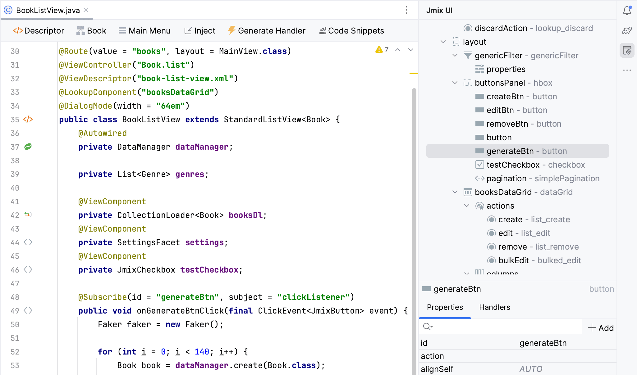
Probably the most noticeable change in Studio is that the Jmix UI tool window with the hierarchy and properties of components is now displayed in the view controller, allowing for various operations without the need to open the XML descriptor.
It can be very convenient to see the components tree, change component properties or even add new components while working with Java code in the controller.
There is another improvement related to the Preview panel.
Showing preview requires building the frontend and starting Vaadin Development Mode Server, which can be time-consuming. To save time on the project opening, the Preview panel is now opened only when you click Start Preview button in the top panel of the XML editor. Once activated, the preview will remain active for all subsequently opened views of the project. To deactivate the preview, simply click Stop Preview.
We have also done a lot of work on separating the preview functionality from the rest of the visual designer mechanisms. The preview uses JCEF embedded browser which is sensitive to the nuances of non-standard configuration of the project, IDE, and operating system. Now potential problems in this fragile part of the system don't affect the Jmix UI tool window and code generation features.
Coding Assistance
In this release, we have introduced a brand new approach for injecting dependencies and UI components into view classes and Spring beans.
Once you start typing characters inside a method body, a code completion dropdown will appear, showing the available beans, UI components, local variables, and class fields. Beans and UI components that have not yet been injected into the class will be displayed in italic font. If you select one of these items, it will be automatically injected into the constructor or a field with the appropriate annotation (@Autowired or @ViewComponent), making it immediately available for use at the current cursor position.
With this feature, finding and injecting available beans and UI components is a breeze. We hope you will enjoy it!
Support for Data Repositories
Studio now has full support for creating and managing Spring Data repositories.
You can create a repository by clicking New → Data Repository in the Jmix tool window toolbar. Studio will create the repository interface and display it under the entity node.
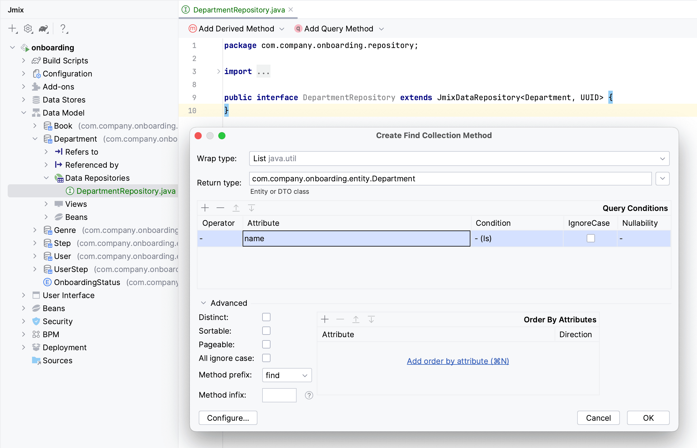
Use the Add Derived Method and Add Query Method buttons in the actions panel of the repository code editor to create repository methods with derived or explicit queries:
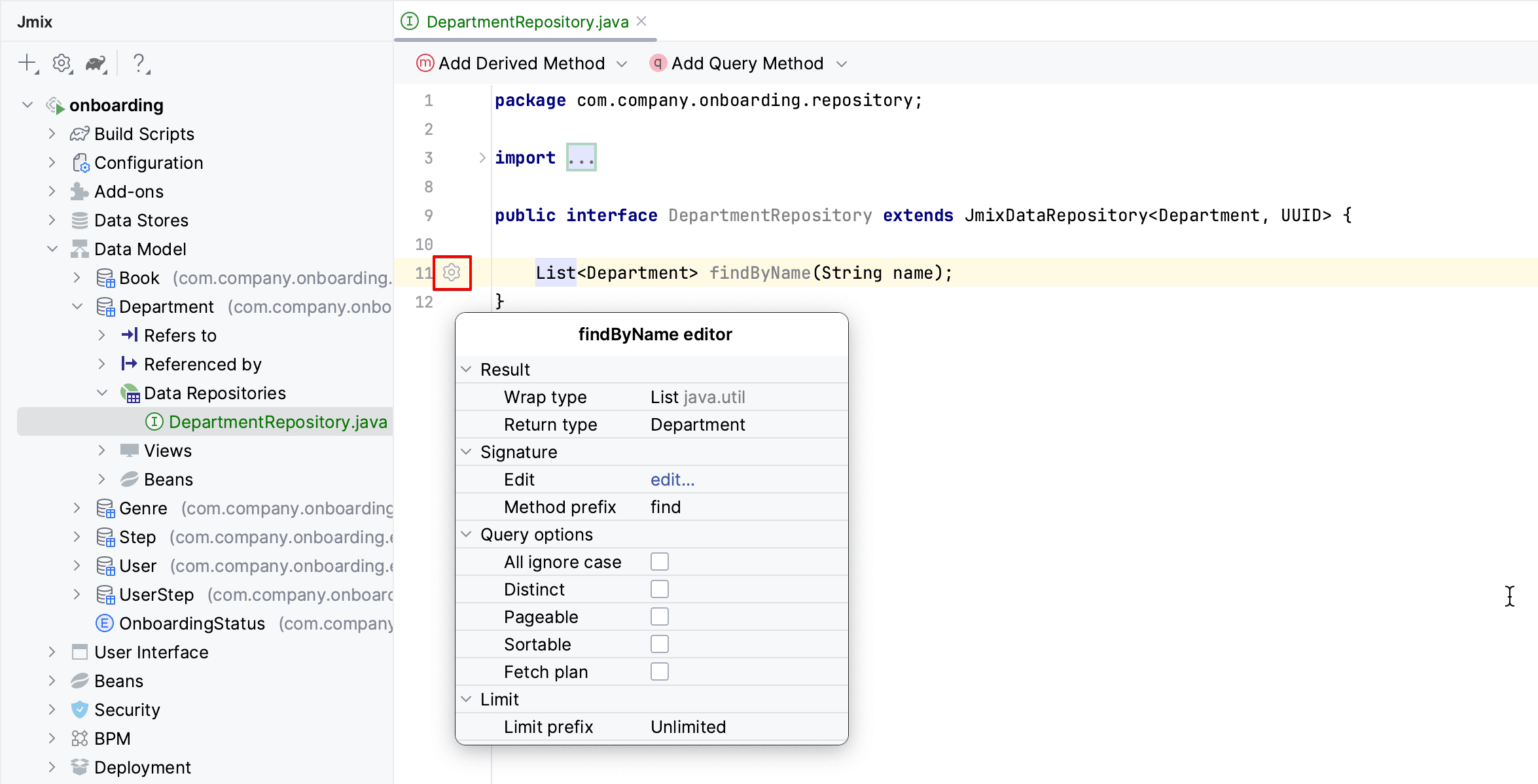
For existing methods of a repository, Studio displays a gutter icon that allows you to adjust the method parameters, for example to add sorting or a fetch plan:
Commenting Data Model
One more feature that I would like to highlight in this article is the ability to add comments to entities and their attributes.
The entity designer now contains the Comment fields for both the entity and each attribute. You can set comments and they will be displayed in the fields:
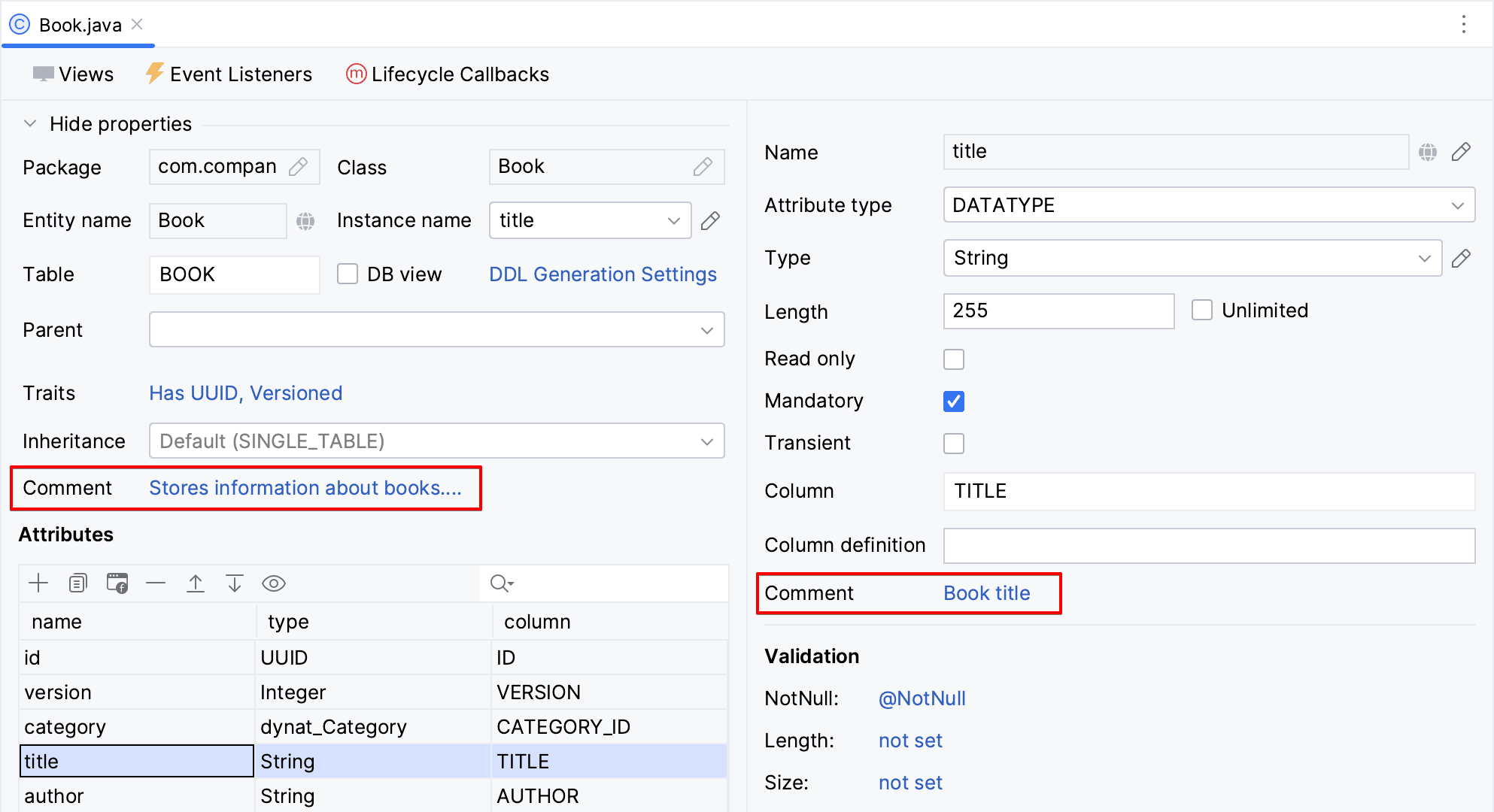
The text entered in the designer is stored in the @Comment annotations of the entity class and its fields:
@Comment("""
        Stores information about books.
        Has reference to Genre.""")
@JmixEntity
@Table(name = "BOOK")
@Entity
public class Book {
	// ...

	@Comment("Book title")
	@Column(name = "TITLE", nullable = false)
	private String title;
Studio generates setTableRemarks and setColumnRemarks Liquibase changelog operations to store comments in the database schema (for all databases except HSQL). This allows the comments to be accessed through any database inspection tool. You can also extract comments from metadata or directly from class annotations in order to display them in the application UI or generate documentation.
What's next?
In the next feature release scheduled for February 2024, we are going to implement the new Charts add-on and finish the work on the Maps add-on features. The UI layer will be enhanced with the addition of the RichTextArea component, horizontal main menu and the ability to search through the main menu items. We are also going to streamline the usage of data repositories in UI views.
On the Studio side, we'll provide hot deployment of BPMN business process definitions, the generation of custom REST controllers, and the scaffolding of integration tests for your entities and views.
Our detailed roadmap for future releases is available as a GitHub project. Patches for the current version 2.1 will be released approximately once a month to ensure regular updates.
We appreciate your feedback on our forum, and we are grateful to everyone who has contributed their ideas, suggestions, and bug reports!


