Overview
Reporting is based on the YARG framework and designed to simplify the reports generation in CUBA applications.
The add-on enables creating report templates in the most popular editors like Microsoft Office and LibreOffice/OpenOffice and defining data sources at runtime, using CUBA data model, SQL, JPQL or scripts.
Features
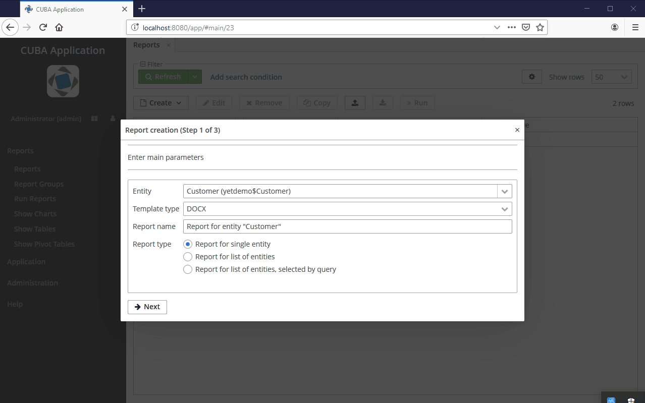
- Building report templates visually at runtime with a step-by-step wizard.
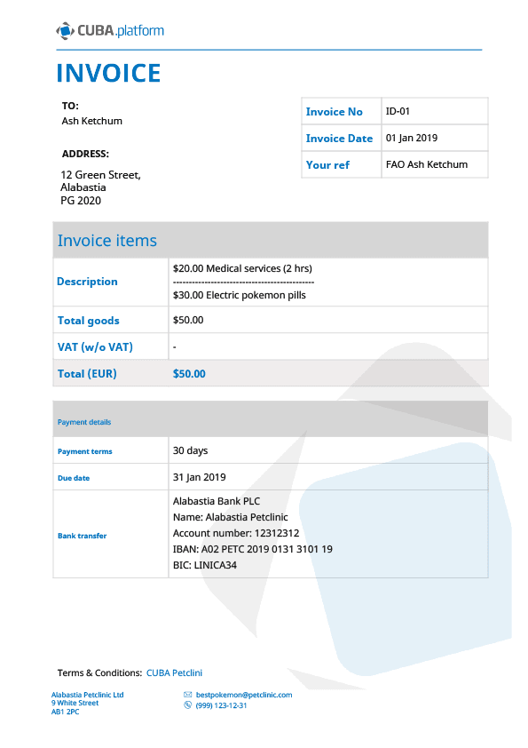
- Generating reports in DOC, DOCX, ODT, XLS, XLSX, HTML or in arbitrary text formats.
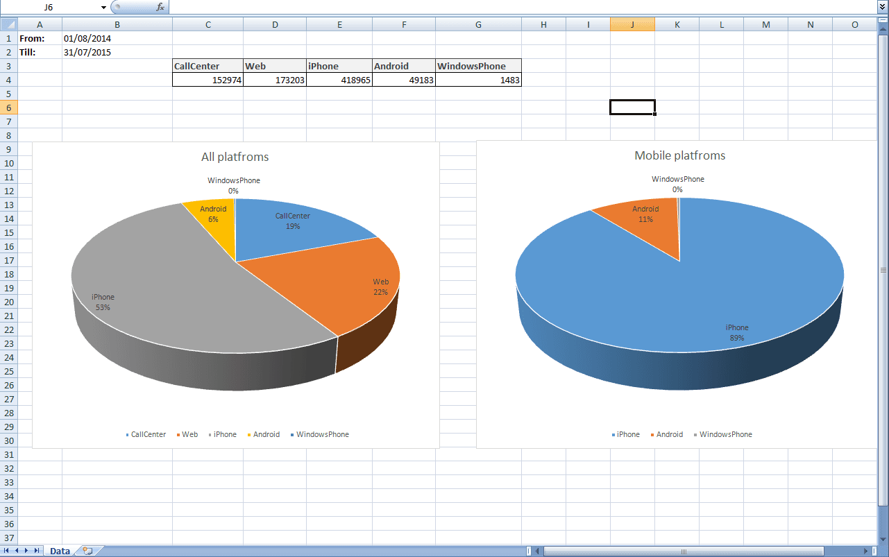
- Creating complex XLS(X) reports: multi-tiered reports, reports with data aggregation, crosstab reports.
- Using diagrams and formulas in XLS(X) reports.
- Converting reports in office formats or HTML to PDF.
Links