


Robust reporting is a baseline requirement for most business applications. Companies expect outputs in HTML, DOCX, PDF, or XLSX, complete with data tables and visuals. Creating that kind of functionality – especially if you want it to be end-user configurable – is a heavy lift, but Jmix can handle it for you.
Follow this article to create a project management application that produces Excel reports with a Gantt chart, giving managers a concise overview of the project timeline.
Prerequisites
To follow along you will need the following:
-
IntelliJ IDEA with Jmix plugin
Installation steps can be found here. If you’re new to Jmix, watch the Jmix Studio features overview to get started quickly. -
Reports add-on
See the add-on description on Jmix marketplace. Installation steps can be found here.
Building Data Model
Every business application, especially the one that will eventually produce reports, relies on data. Let’s start there by defining a simple data model:
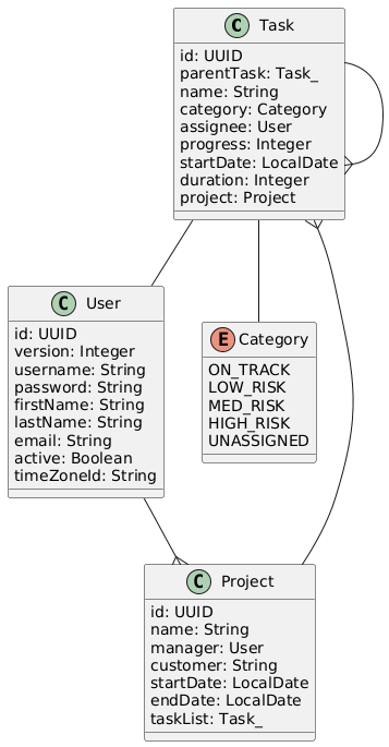
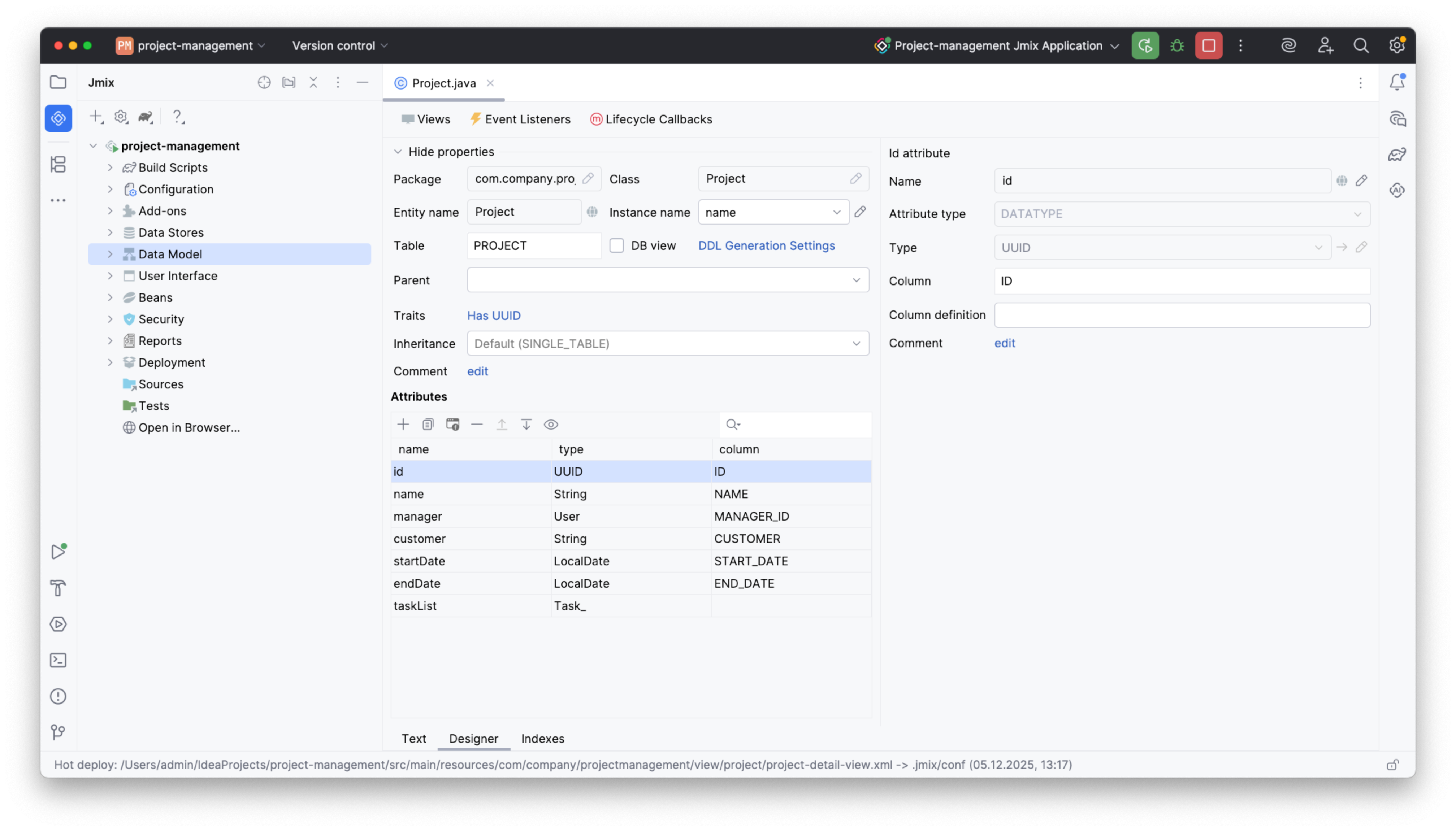
This diagram serves as your blueprint for a project management system. Note that the User entity is present by default, so skip that and just add Project, Task, and the Category enum using the Entity Designer in Jmix Studio. This is what the Project entity will look like:
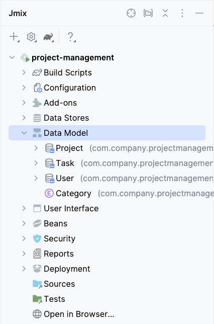
One by one, all the diagram items will appear in the Data Model section:
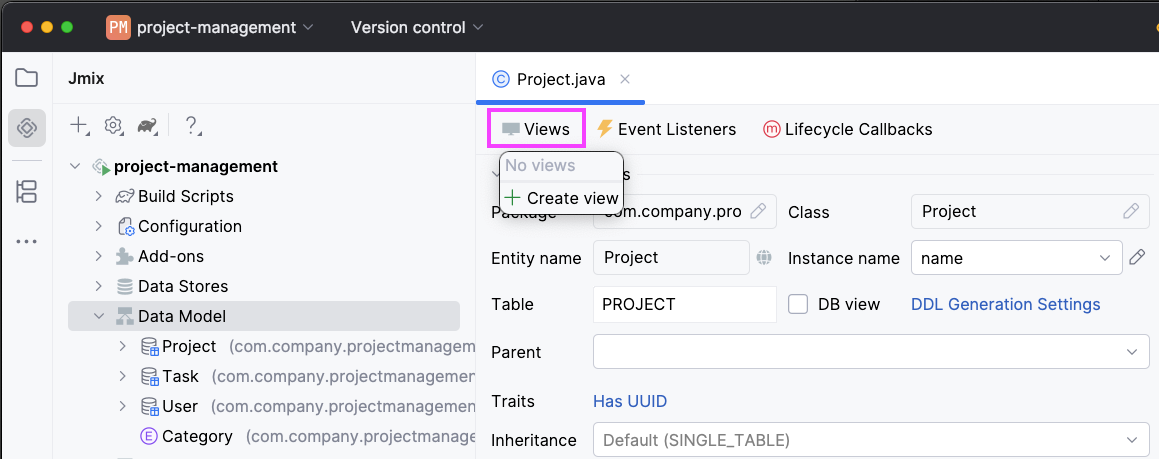
Creating CRUD views
Creating CRUD views is just as simple. Open the Project entity and click Views -> Create view:
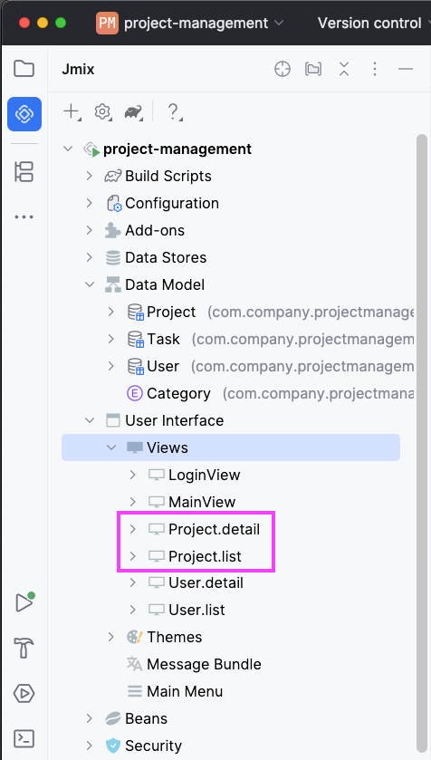
The view creation wizard will let you select from a collection of view templates. Select List and Details views and follow the steps in the wizard.
Feel free to make any adjustments or stick with the default settings; you can always modify these views later if necessary. Both Project.list and Project.detail views will then appear in the Views section:
There are some default views here as well. Additionally, you can create CRUD views for the Task entity – this can help insert sample data.
Running the Application
With this minimal setup, you already have a functional app. To run it, press Run in your IDE. After a short build, open a browser and go to http://localhost:8080.
Here’s what the running app looks like, complete with some sample data for better illustration:
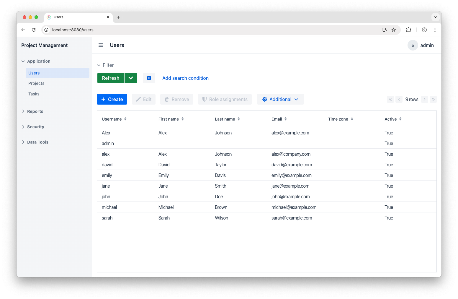
This view displays everyone I work with on my projects. Note that it is included from the start as part of the application template.
Let’s also look at the Projects view that we set up ourselves:
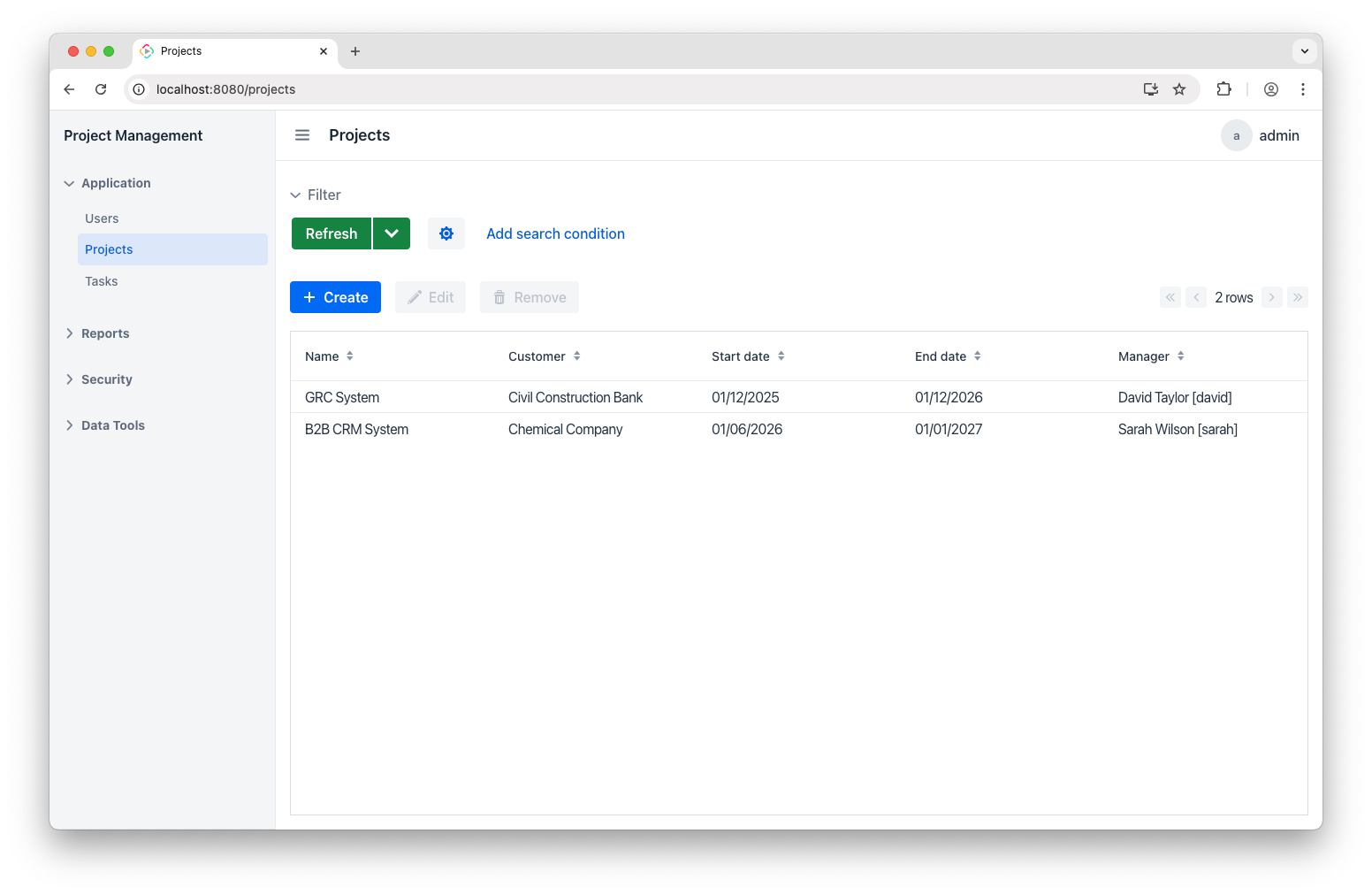
Here I’ve added two projects —** B2B CRM System** and GRC System. Clicking into each one reveals its details:
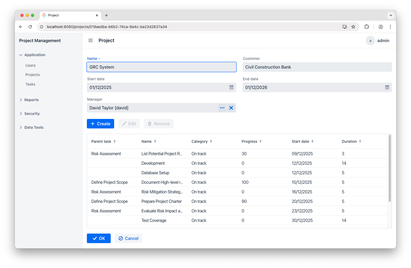
You’ll also see the task list right there. It could have been added in the view creation wizard, or any time later via the Add to Views button:
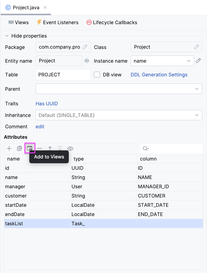
Doing so adds an appropriate visual component to selected views. You don’t have to restart the app for this change to take effect – Hot Deploy in Studio will push it live on page refresh.
Report Template
Now that we’ve done a quick tour and have some sample records in place, we can move on to building a report. First and foremost, let’s create a report template to guide its future structure.
Open your preferred spreadsheet application, such as Excel, Open Office, LibreOffice, or an online tool like Google Docs. The key requirement is that it can save files in the desired format.
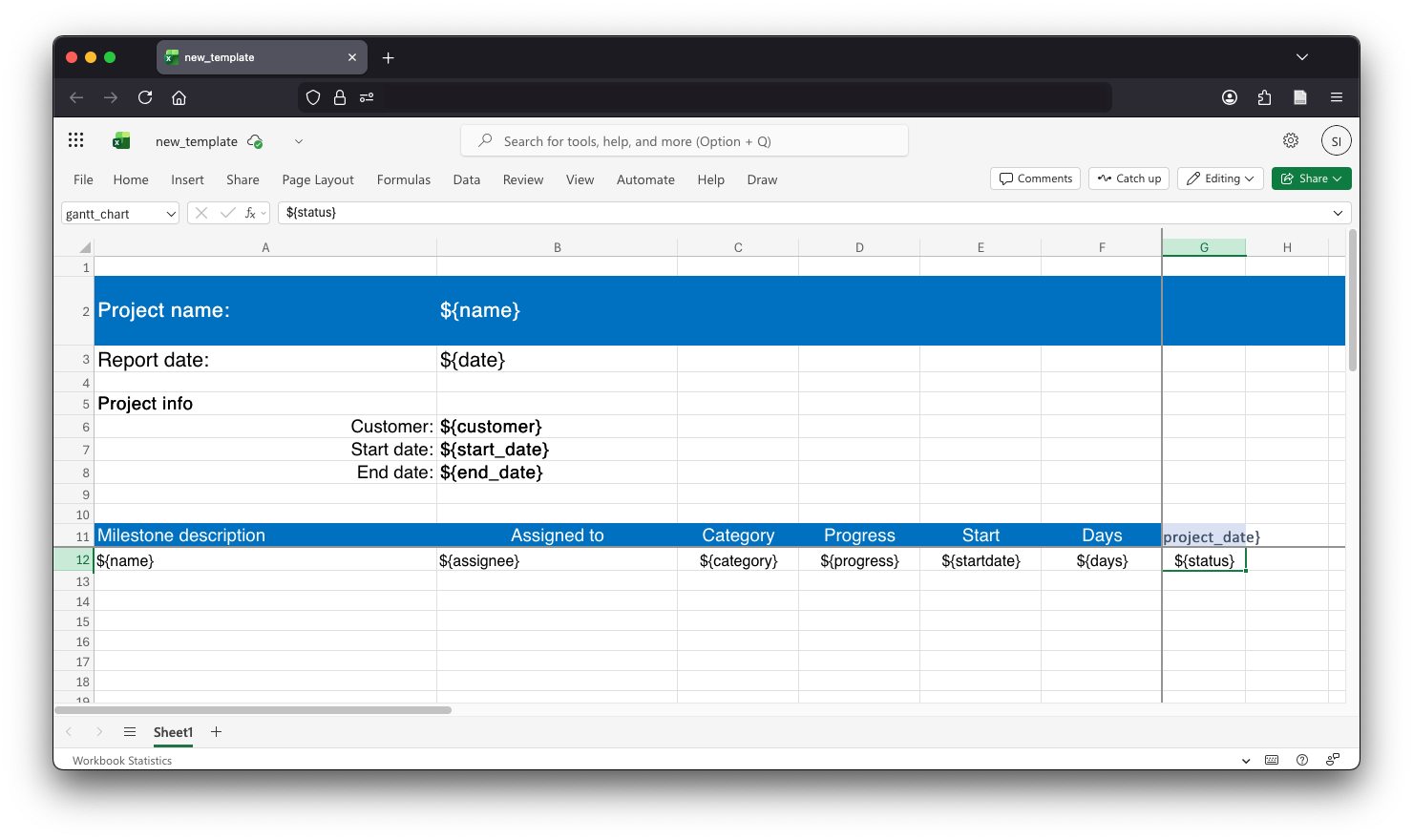
I'm using the web version of Excel, part of Microsoft 365, and here’s what my template looks like:
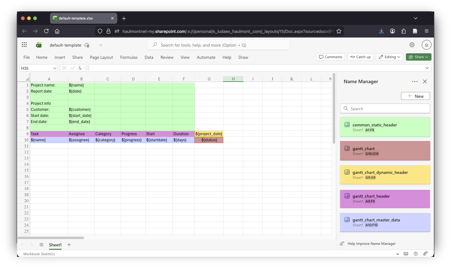
It includes several placeholders along with so-called named regions (colors are just to see them better). There are 5 of them:
- common_static_header : this is the main header for the report.
- gantt_chart: here is where the actual Gantt chart is to be displayed.
- gantt_chart_header: this is the table header with static content.
- gantt_chart_dynamic_header : this region includes dates that will change based on the report generation date, project, and task timeframes.
- gantt_chart_master_data: this region holds the list of tasks and related info.
Placeholders and named regions are essential for correctly placing data. Be sure to add all the elements and check their names, since the report bands that we'll be adding shortly will rely on them. After that, save your template as default-template.xlsx.
Building a Report
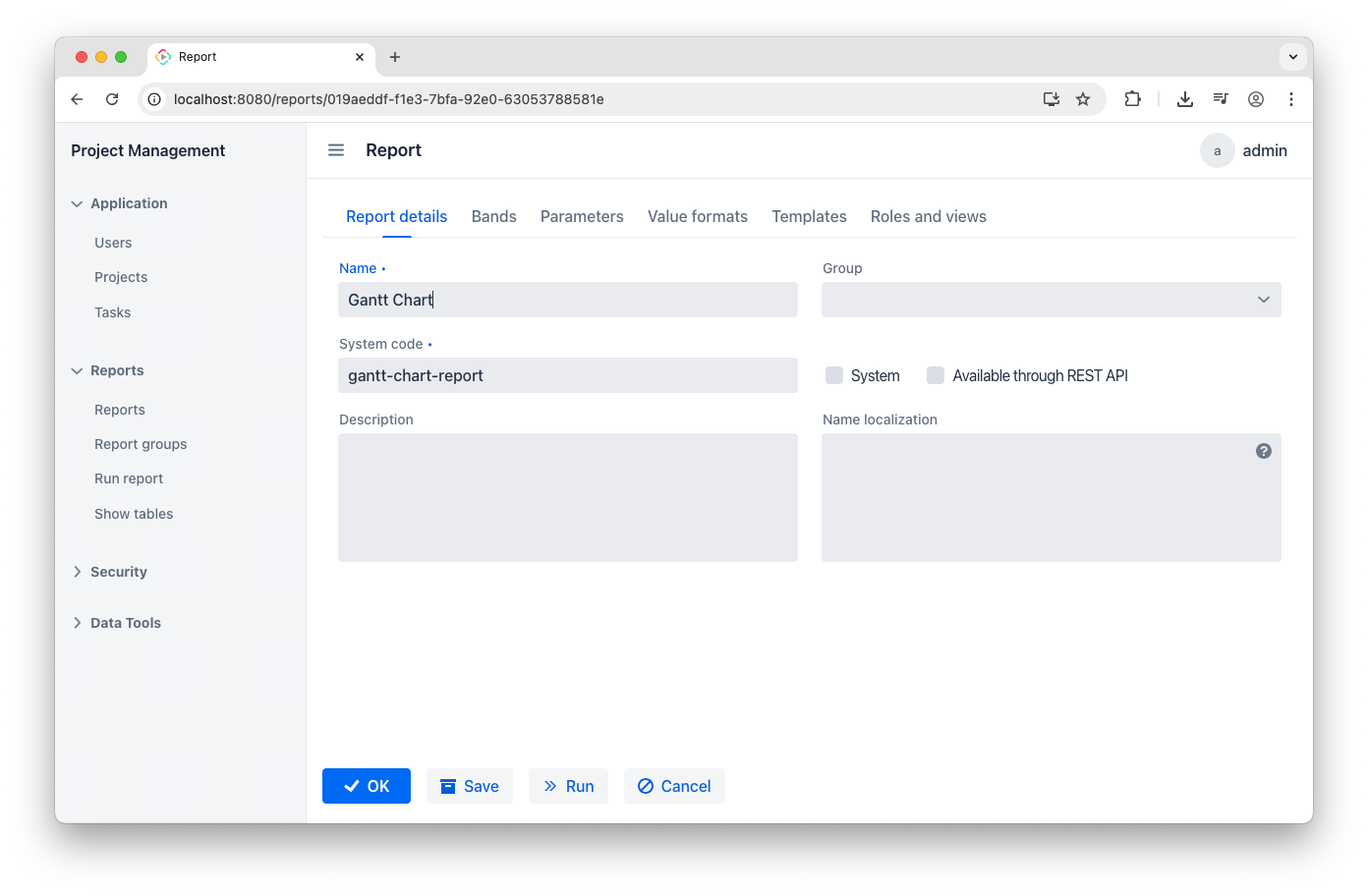
Following the prerequisites, I have installed the Reports add-on, which is now shown in the application menu. To start creating a report, go to the Reports view, click Create, and type the report name and code:
Add the Template
Now, let’s add the template we created earlier. This just means uploading your default-template.xlsx file. You can do this on the Templates tab:
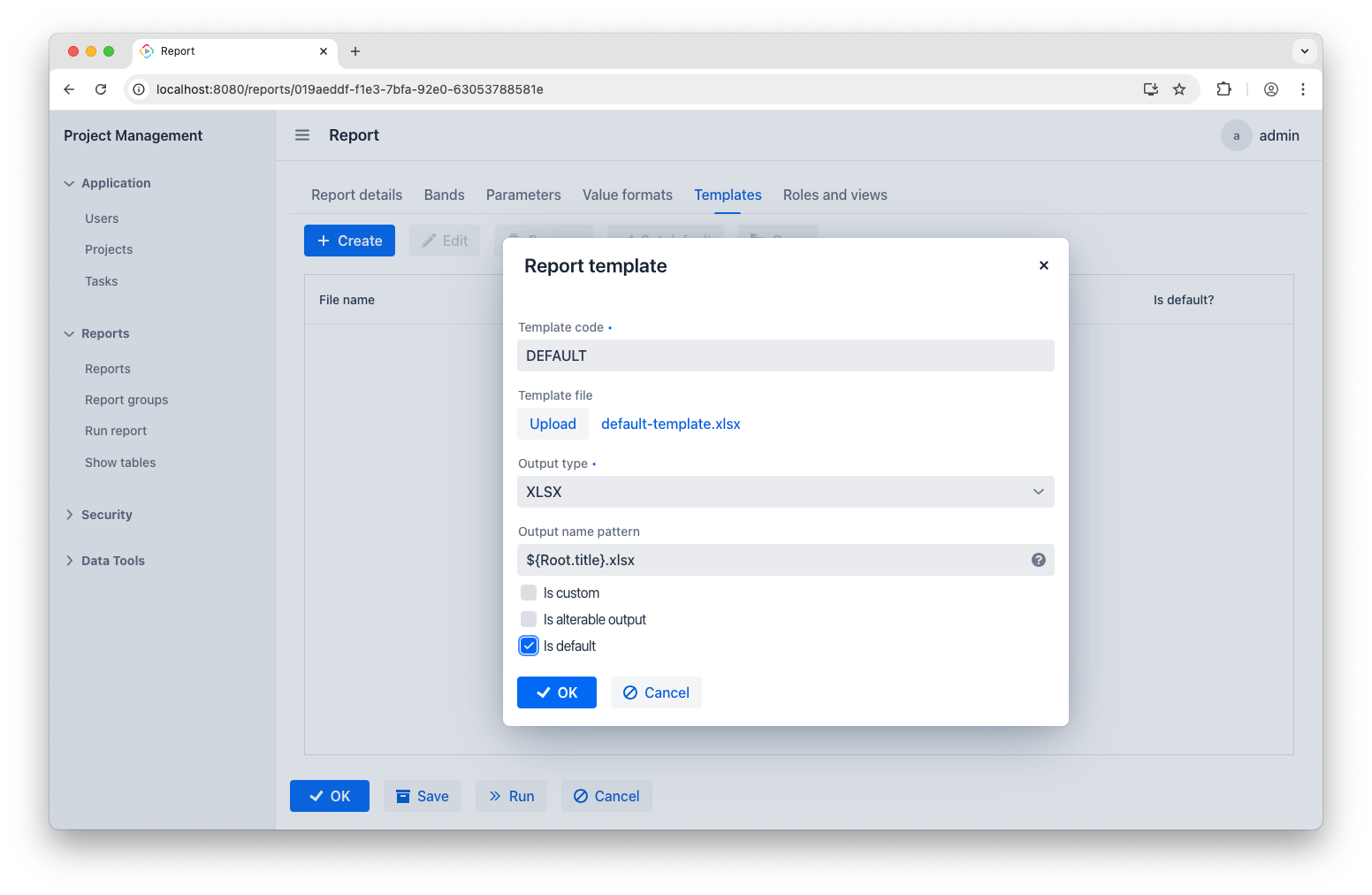
Keep in mind that the template file extension must match the output type.
Parameters
Next, go to the Parameters tab. Our report needs two parameters to function. The first is the Project parameter:
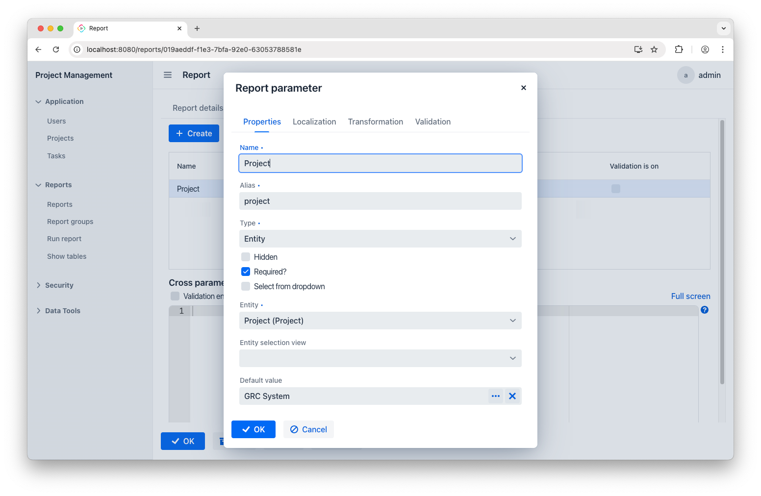
This will let us work with tasks from the GRC System project.
The second parameter is Date:
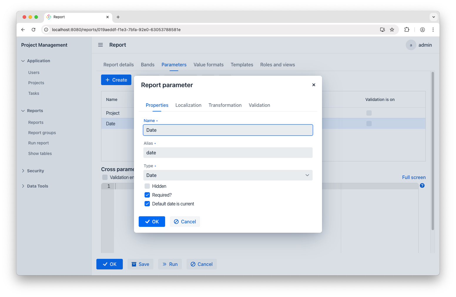
It just means the starting date. I want the report to show only the tasks that come after. It’s generally best to use the current date for this.
Bands
Finally, it’s time to set up the report bands. As mentioned earlier, bands make it possible to transfer app data to the named regions in the report template. Each band can collect required data using one or more datasets. When it uses just one dataset, it can create a simple row or column.
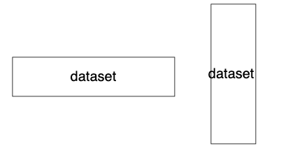
Using several datasets in one band helps present related data. For a Gantt chart, which is essentially a table, we’ll need a crosstab band that gathers data to three datasets: one for column labels, one for row labels, and one for cells in the table related to both rows and columns.
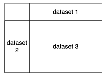
This concept is sometimes referred to as matrix report. With this clear, let's go through the setup process one band at a time.
Root band
The Root band is predefined. We’ll use it to create a descriptive filename for our report. Select the Root band and add the Groovy script:
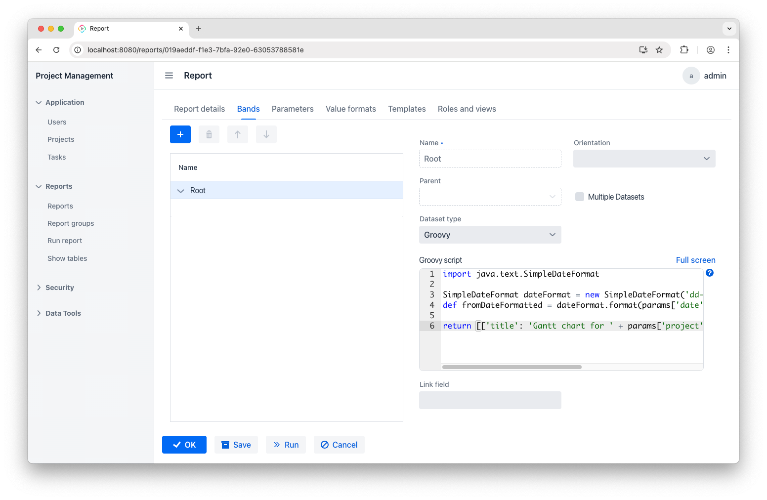
Here’s the code you’ll need:
import java.text.SimpleDateFormat

SimpleDateFormat dateFormat = new SimpleDateFormat('dd-MM-yyyy')
def fromDateFormatted = dateFormat.format(params['date'])
return [['title': 'Gantt chart for ' + params['project'].name + ' project on ' + fromDateFormatted]]
As a result, reports will have filenames like “Gantt chart for GRC System project on 20-12-2026.xlsx”.
comon_static_header band
The next band will gather general project info and put it in the common_static_header named region:
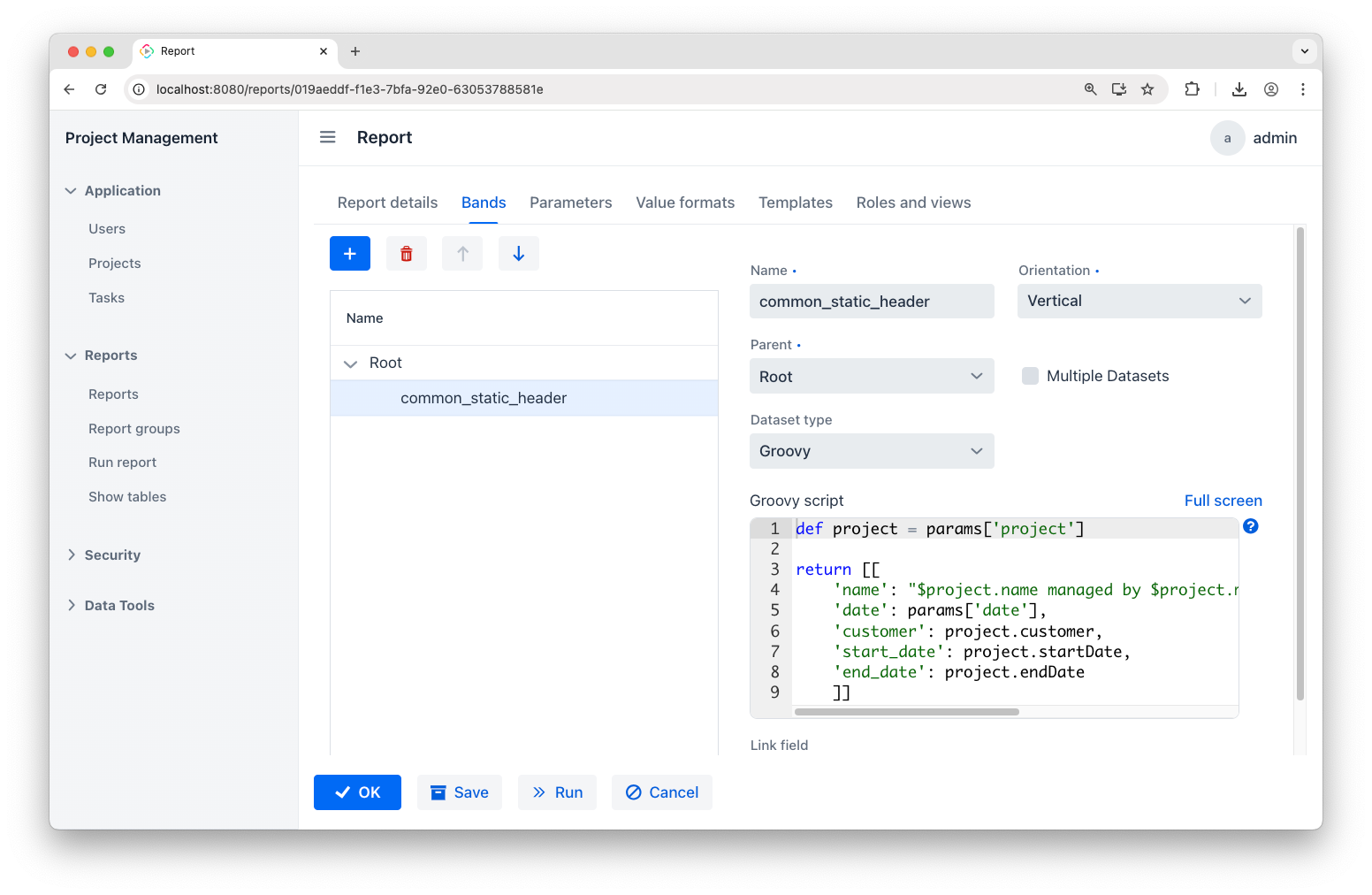
The code is as follows:
def project = params['project']

return [[

    'name': "$project.name managed by $project.manager.firstName $project.manager.lastName",

    'date': params['date'],

    'customer': project.customer,

    'start_date': project.startDate,

    'end_date': project.endDate

    ]]
gantt_chartt band
Finally, add the gantt_chart band and set its orientation to Crosstab – it will automatically include three datasets:
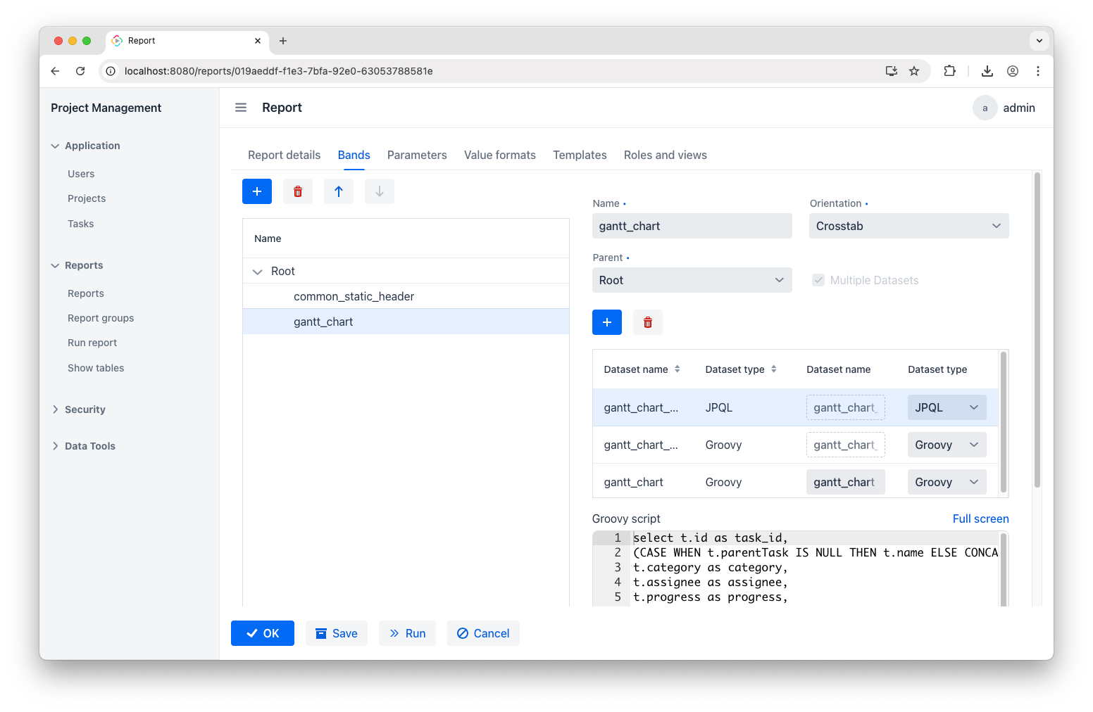
Update the dataset names to align with the named regions from the report template: gantt_chart_master_data, gantt_chart_dynamic_header, gantt_chart. Then, configure them with the code below.
JPQL query for gantt_chart_master_data:
select t.id as task_id,

(CASE WHEN t.parentTask IS NULL THEN t.name ELSE CONCAT('->', t.name) END) as name,

t.category as category,

t.assignee as assignee,

t.progress as progress,

t.startDate as startdate,

t.duration as days

from Task_ t

where t.project = ${project}

and t.project.endDate >= ${date}

order by t.startDate
This query retrieves all tasks related to a specific project while indicating subtasks with "->" and sorting by the start date.
Groovy script for gantt_chart_dynamic_header:
import java.time.LocalDate

import java.time.ZoneId

import java.time.temporal.ChronoUnit

import com.company.projectmanagement.entity.Task

import java.time.format.DateTimeFormatter


DateTimeFormatter dateFormatter = DateTimeFormatter.ofPattern("d-MMM")

def tasks = dataManager.load(Task.class).all().list()

def fromDate = params['date'].toInstant().atZone(ZoneId.systemDefault()).toLocalDate()

def latestDate = tasks.collect {it.startDate.plusDays(it.duration - 1)}.max()


// Generate date list

def result = []

if (latestDate && !latestDate.isBefore(fromDate)) {

    long daysBetween = ChronoUnit.DAYS.between(fromDate, latestDate)

    (0..daysBetween).each { i ->

    LocalDate projectDate = fromDate.plusDays(i)

    def formattedDate = projectDate.format(dateFormatter)

    result.add(["header_id" : projectDate, "project_date": formattedDate])

    }

}

return result
This script loads all tasks to find the latest end date by adding each task’s duration to its start date, which will be used for creating table header.
Groovy script for gantt_chart:
import java.time.ZoneId

import com.company.projectmanagement.entity.Task


def tasks = dataManager.load(Task.class).all().list()

def fromDate = params['date'].toInstant().atZone(ZoneId.systemDefault()).toLocalDate()


def result = []

tasks.each {task ->

    (0..<task.duration).each { i ->

        def taskDate = task.startDate.plusDays(i)

        if (taskDate >= fromDate) {

            result.add([

                "gantt_chart_master_data@task_id": task.id,

                "gantt_chart_dynamic_header@header_id": taskDate,

                "status": "-"

            ])

        }

    }

}

return result
This loads all tasks and checks each task’s duration from a specified start date and further formatting them for a Gantt chart.
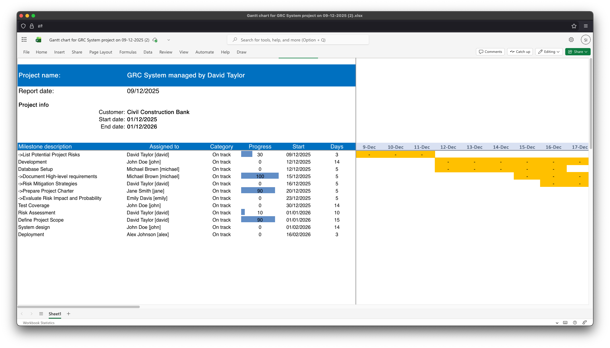
Generate the report
You can generate the report now. When you open it, here’s what you’ll find:
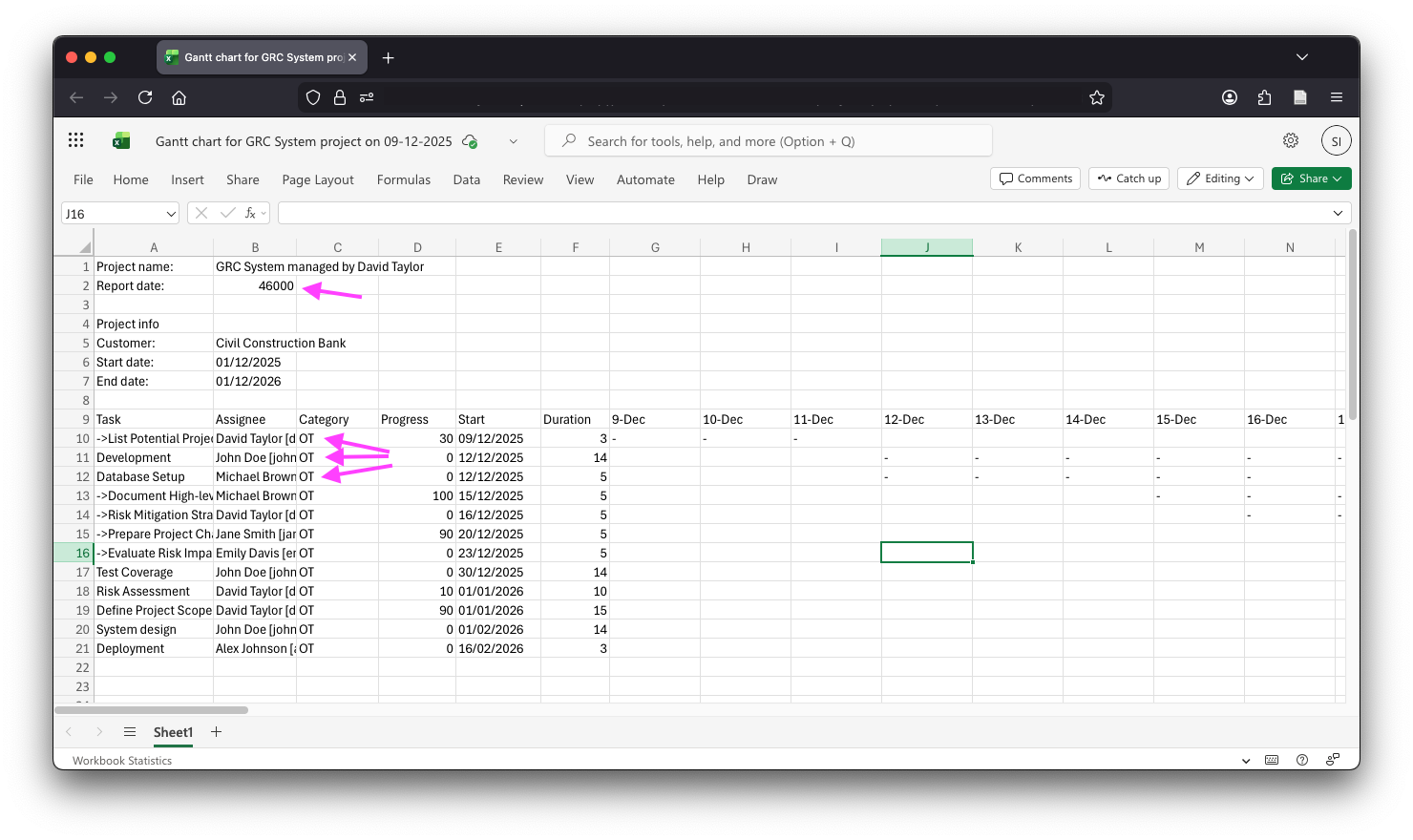
Overall, it looks great! I’ve just noticed a couple of minor issues: those arrows point at the poorly formatted report date and the categories, which appear as raw enum IDs. Luckily, we can fix both quite easily.
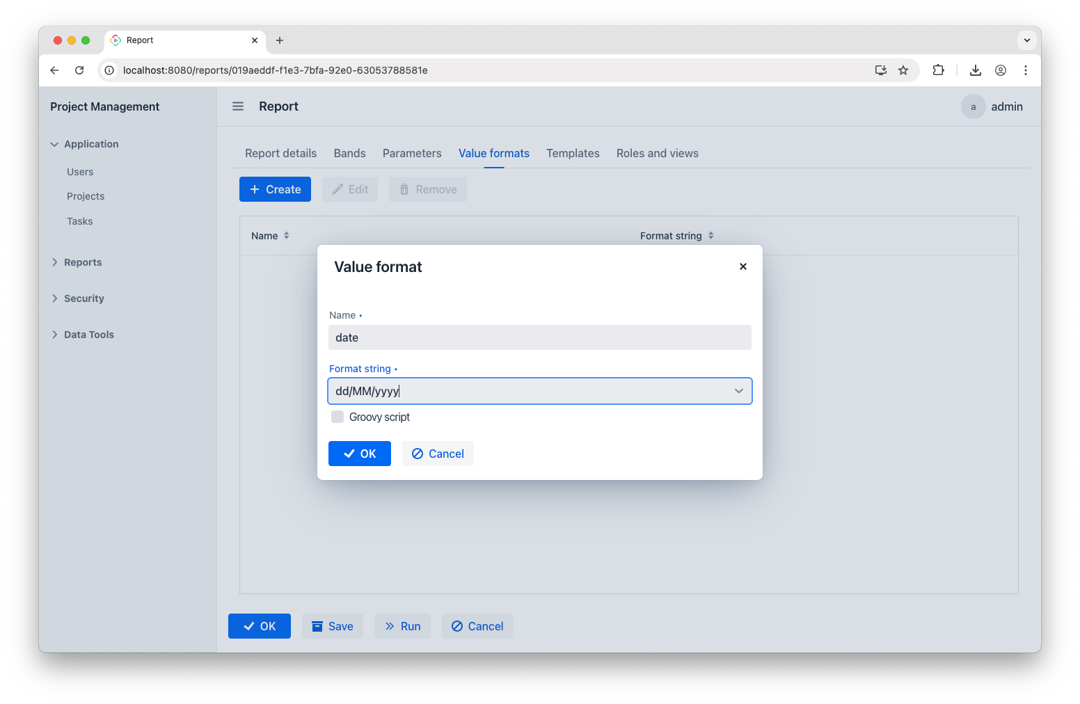
Value formats
To make those fixes, let’s get back to the report and open the Value formats tab. To address the date format issue, add the following entry:
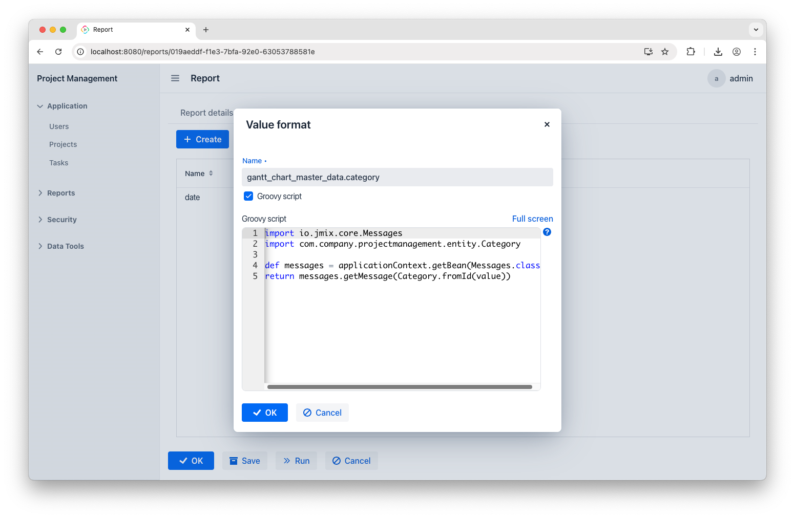
Next, add another entry to fix the category names:
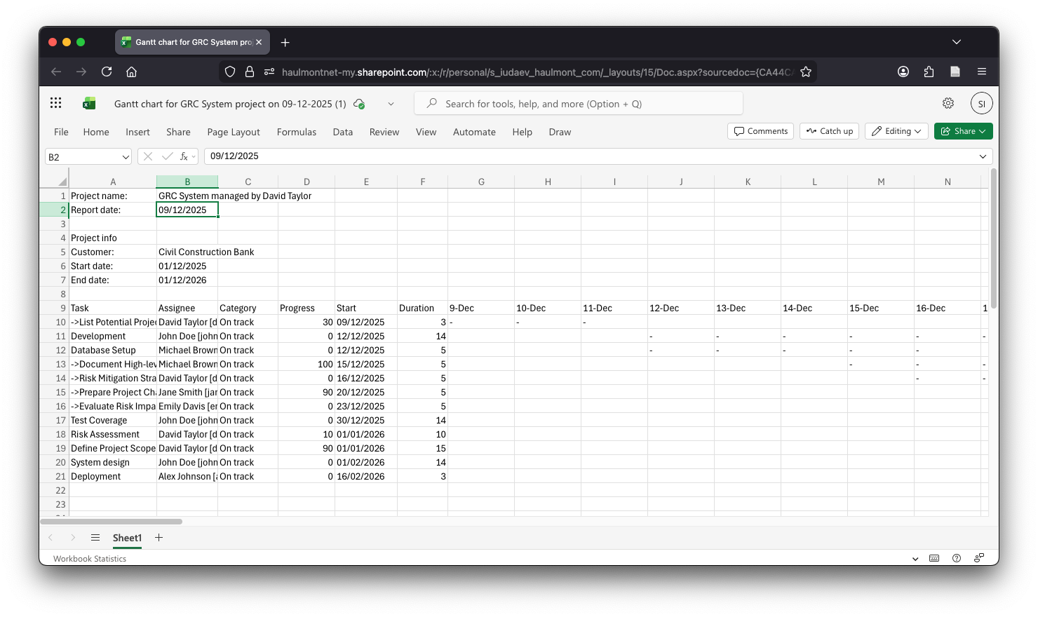
Updating these formats will give you a polished report:
Further Improvements
Making reports visually appealing is beyond the scope of this short article, but the idea is simple. Just tweak your template: change fonts, add table borders and colored headers, freeze columns, and apply conditional formatting. This last one is especially handy for Gantt charts – make a rule that colors cells when they have a value.
Once you’ve made the changes, upload the new template to replace the default one and run the report once again:
Conclusion
Reports take many forms, and Jmix reporting capabilities are way broader than what we've seen so far. It allows you to define report structure as Java class during development, add diagrams and formulae, generate reports through REST API, and use almost any output format. To dive deeper, check out the Reports documentation. Also, don’t hesitate to use Jmix AI Assistant – it’s of great help when it comes to writing JPQL queries and Groovy scripts!


